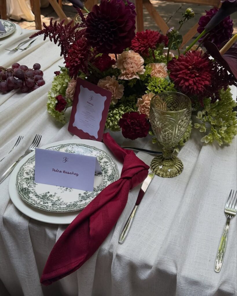
These 11 ideas for an olive green and burgundy wedding run from linen rentals you order online to olive branches your florist tucks into centerpieces.
What you actually do depends on whether your budget is modest or full-scale, and whether your wedding falls in autumn, when this palette belongs, or in spring, where it fights the season.
The single olive green base tier with fresh figs on an otherwise ivory cake shows how the color pair works without letting either shade overwhelm the room.
[link-whisper-related-posts]1. Olive Green Linens
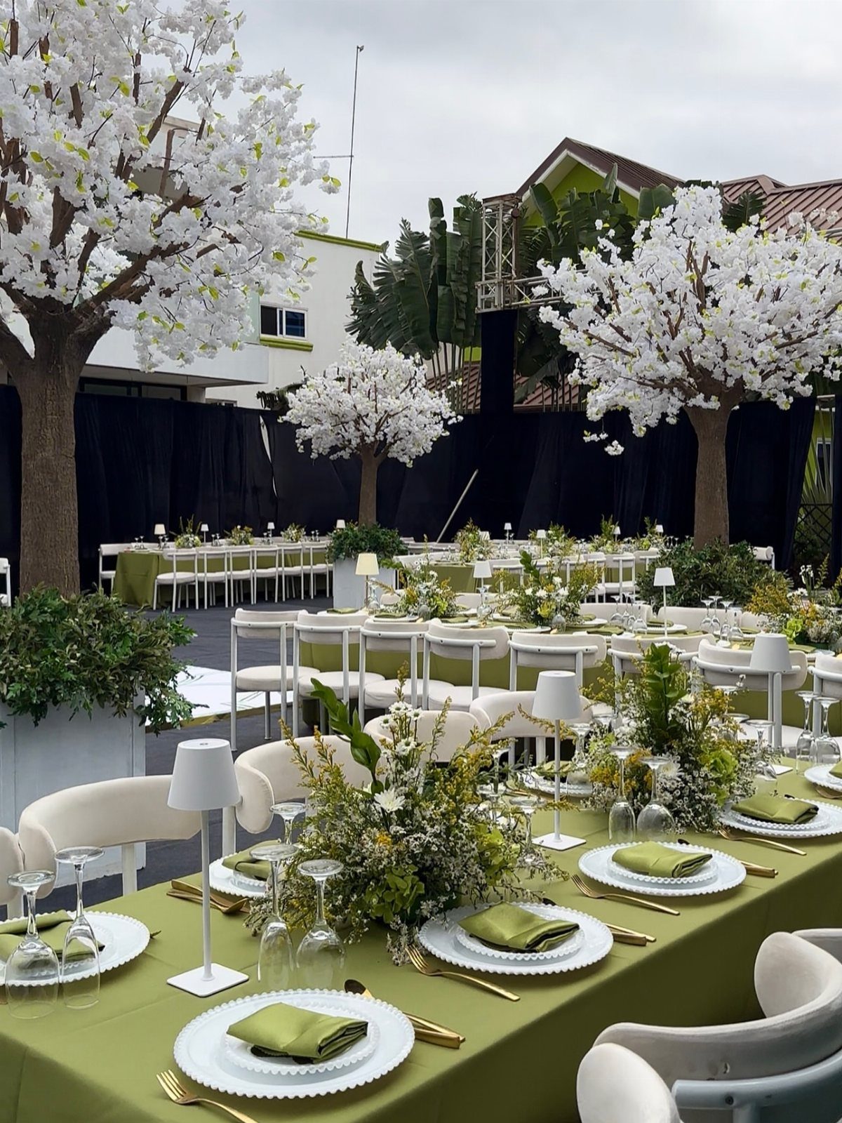
Olive green linens read as grounded rather than rustic when the fabric has some weight to it.
I have seen this color go wrong on thin polyester that photographs flat and cheap; a cotton blend or velvet-weight holds the depth better.
A full table cover in olive green carries more color than a runner, so the shade reads as the room’s base rather than an accent.
Pair it with burgundy through napkins, a stationery card at each place, or fruit in the centerpiece rather than competing fabric layers.
If your venue supplies standard white, renting olive is a single swap that changes the whole room without adding setup complexity.
2. Burgundy Floral Arrangements
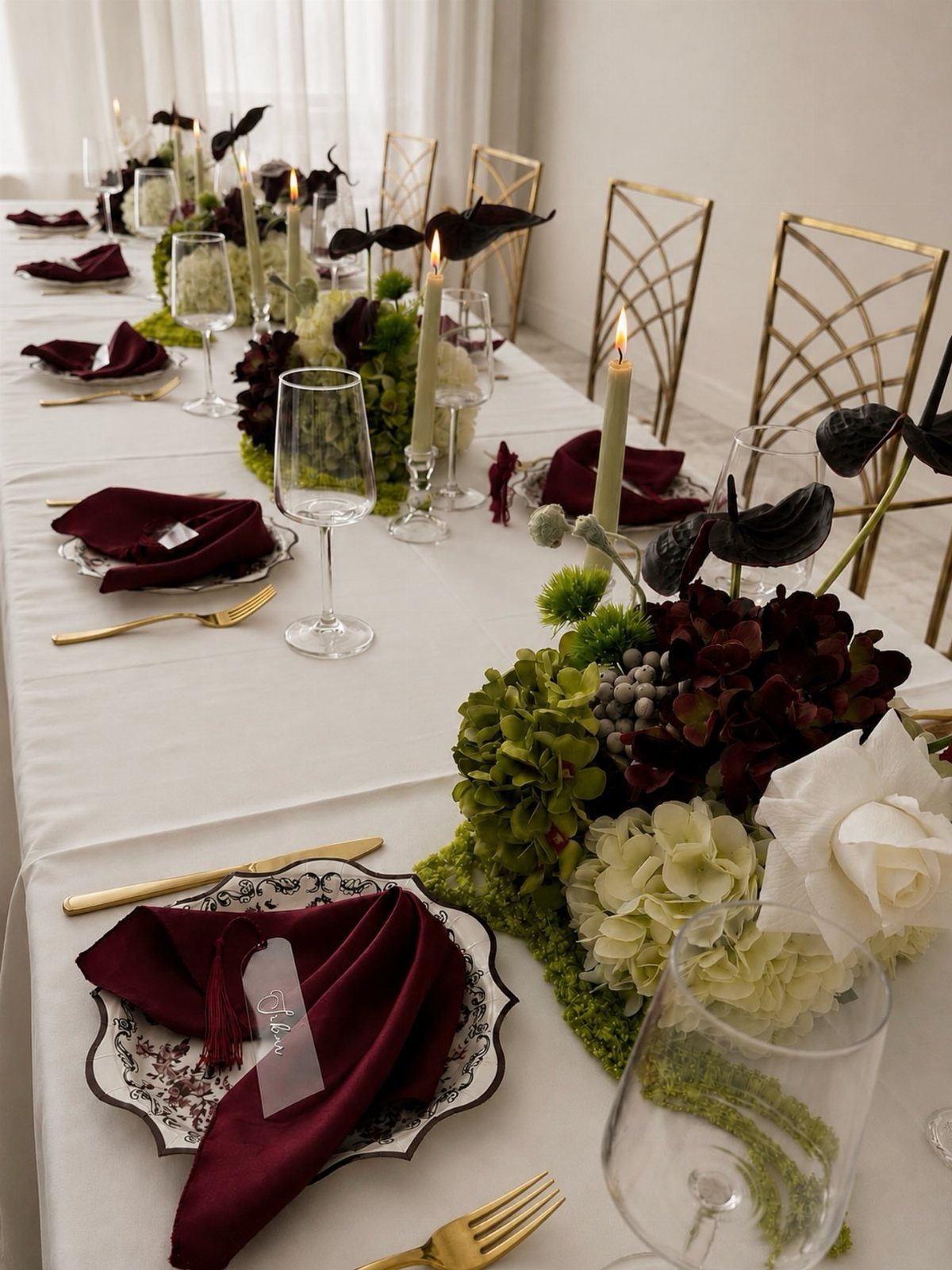
Burgundy flowers carry their own drama, so the arrangement does not need size to register.
Dahlias hold that saturated color through the season; roses work but can read more formal. Green hydrangeas and white blooms mixed into burgundy arrangements keep the palette from going too dark under indoor lighting.
I would ask a florist about olive branches as the greenery rather than standard eucalyptus; the tone matches the table linens without needing to over-explain a theme.
For a budget version, single-variety burgundy blooms in clusters of bud vases run lower than full centerpieces and still give the color its moment.
3. Gold Cutlery and Candle Holders
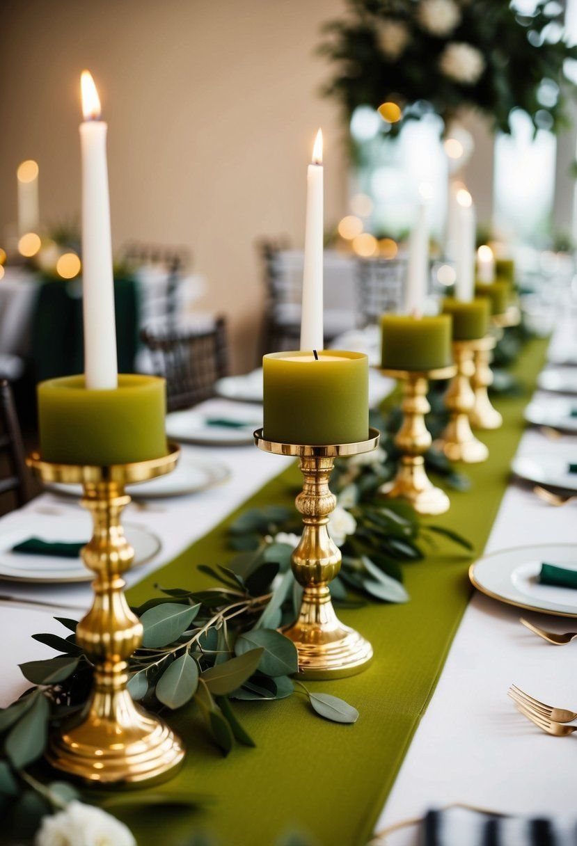
Gold warms up both olive and burgundy in a way silver does not; the metal picks up the yellow undertone in olive and keeps burgundy from looking black in low light.
Brass candle holders with green and white tapers extend the linen color upward; the white taper keeps the pairing from looking like a holiday table.
Cutlery is the easiest place to add gold if rentals are available; candle holders can be bought and resold after.
I have seen hosts use spray paint on thrifted holders, but the finish chips on anything handled, so reserve that for stationary pieces.
4. Burgundy Bridesmaid Dresses
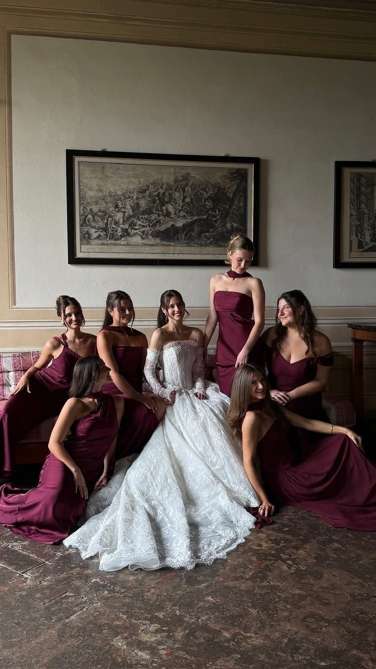
Burgundy bridesmaid dresses photograph well against both outdoor green and indoor neutral walls, which matters when the ceremony and reception sites differ.
A deep burgundy reads as its own color rather than a failed red. I would hold fabric swatches next to actual olive green before deciding, since a purple-leaning burgundy clashes with yellow-leaning olive.
The dresses here are uniform, but burgundy also works as the anchor color in mismatched dresses if the other shades stay in the same saturation range.
For a summer wedding, a lighter fabric in the same dye lot keeps the color from feeling heavy.
5. Olive Green Suits
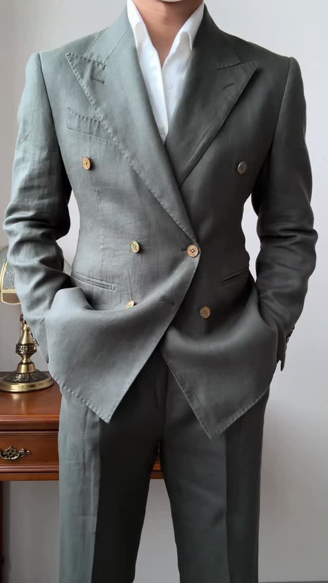
Olive green suits step outside the navy and charcoal loop without going full fashion risk.
Gold buttons on a double-breasted jacket tie back to gold cutlery and candle holders if you are already using them elsewhere; a simpler two-button cut reads more casual.
Linen wrinkles, so the photo’s fabric choice suits a daytime or outdoor setting where that texture fits. For evening, a wool blend in the same color holds a press longer.
I would check the shade under the venue’s actual lighting before final fitting, since olive can shift toward brown or toward green depending on the bulbs, and groomsmen should match each other more than they need to match the tablecloths.
6. Burgundy Satin Napkins
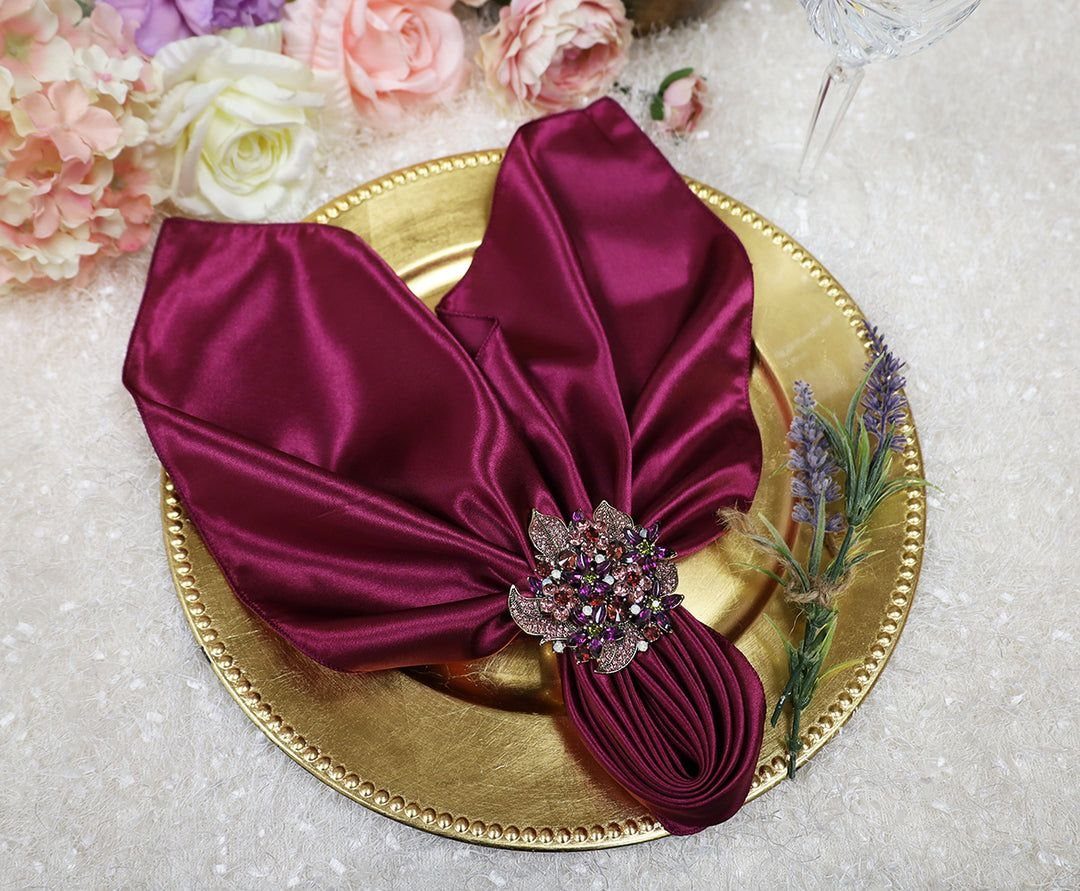
Satin napkins give a formal finish that cotton or linen cannot replicate, though they show water spots and require pressing. A jeweled napkin ring adds one point of reflection, though the satin itself already reads dressed-up against a matte tablecloth.
Pairing burgundy satin with olive green cotton or velvet works because the contrast in texture keeps the two colors from merging into one dark mass.
If your rental company does not carry satin, a burgundy cotton napkin with a satin runner reversed gives the same mix.
The charger plate underneath is doing work here too; it lifts the place setting into its own zone, which matters on long tables where settings can blur together.
7. Floral Stationery
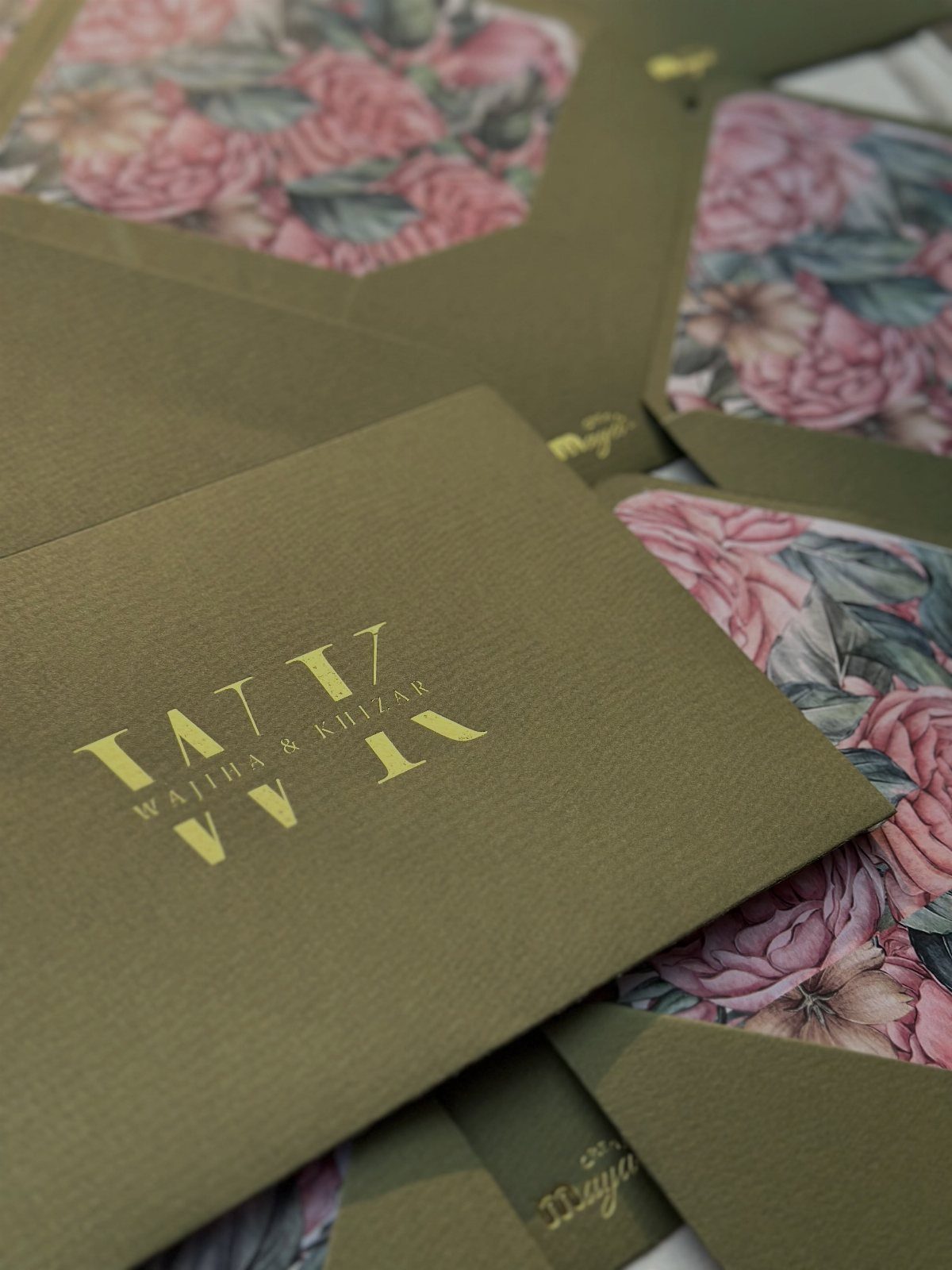
Floral stationery carries the wedding’s color story before guests see the venue. Olive green paper with a burgundy and cream floral liner lets you hand over a physical object that previews the tone.
Gold foil on the names reads formal without extra thickness; the liner does the color work so the envelope stays clean.
I would order a sample printed on the actual stock before committing, since olive shifts on coated versus uncoated paper.
Wax seals and silk ribbon add cost and handling time; skip them if your mailing timeline is tight. The floral pattern here is dense enough that a simpler RSVP card balances the suite.
8. Tiered Wedding Cake
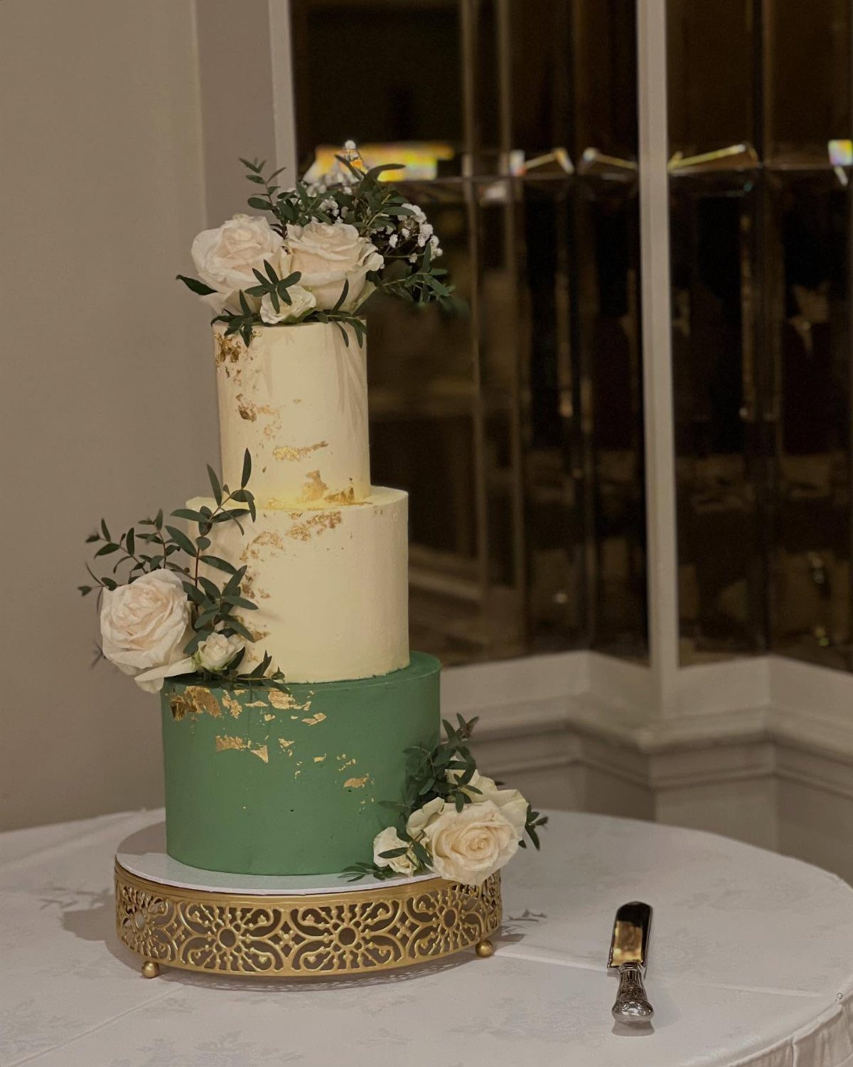
A tiered cake in ivory with one olive green base tier anchors the dessert table without demanding custom piping throughout.
Gold leaf catches light at the reception the way metallic paint cannot; it flakes, so the baker applies it on-site or immediately before.
Gold leaf and white roses keep the palette quiet enough that the greenery reads as accent rather than theme overkill.
2 ivory tiers above the green keep the cake from reading as a centerpiece rather than food. For a budget version, a single green tier with gold leaf dots and grocery-store figs achieves a similar effect.
9. Burgundy and Olive Green Color Palette
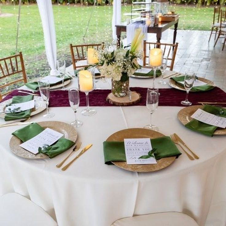
This palette succeeds because both colors are muted enough to share space without competing. Olive green as the base, burgundy as the accent, cream as the breathing room: that ratio prevents the table from going dark.
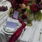
The runner and napkin pairing visible here works because the white tablecloth underneath reflects light upward. I would test fabric swatches together under the venue’s bulbs before ordering, since burgundy can sink to near-black and olive to mud.
Gold chargers add warmth that silver would cool; the menu card repeats the cream so the place setting has its own small palette. No third strong color belongs here.
10. Burgundy and Cream Floral Arrangements
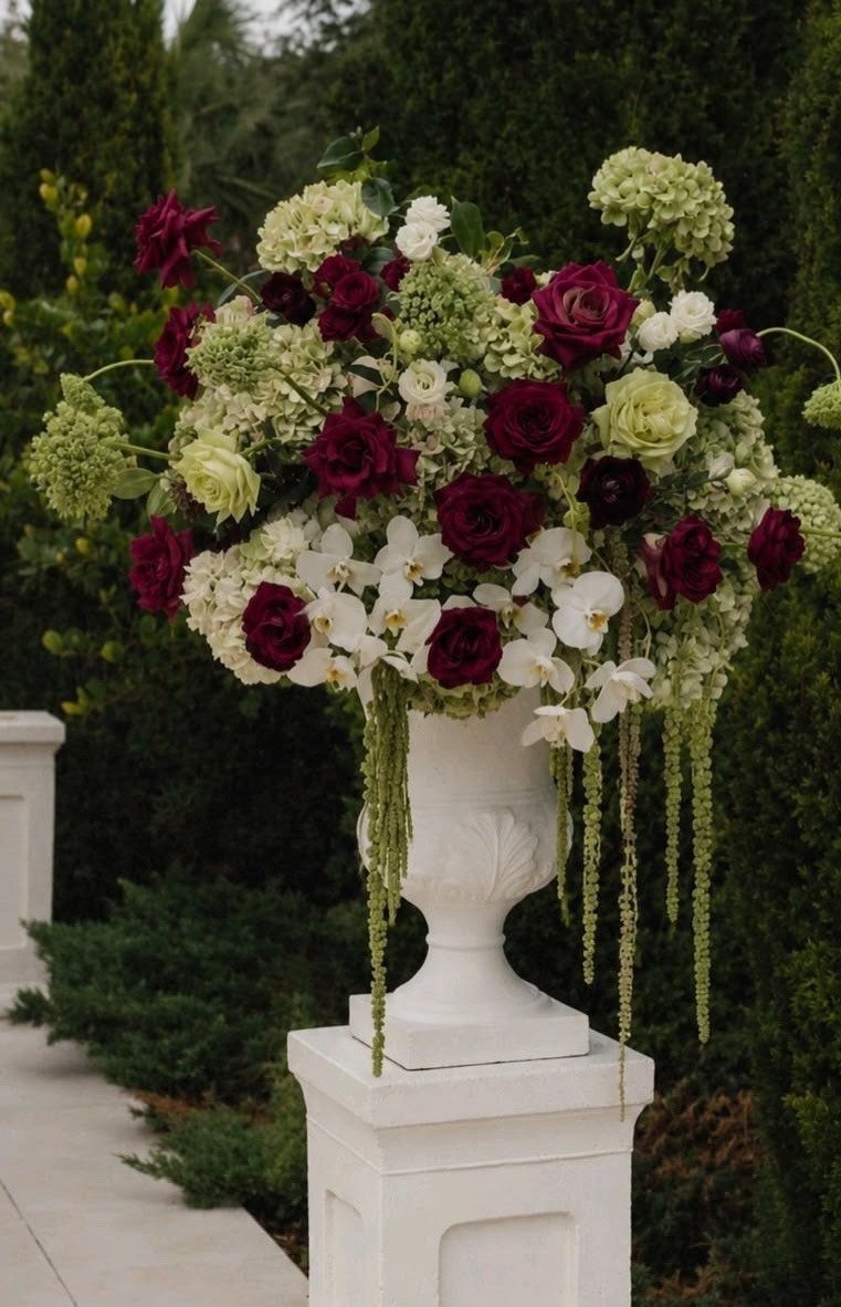
Cream flowers keep burgundy arrangements from photographing as a dark lump. Orchids give height and a shape roses cannot; hydrangeas fill mass at lower cost per stem.
I would ask the florist to keep greenery minimal here; olive branches suit other entries, but in this arrangement they would fight the pale green hydrangeas.
For a budget version, cream stock flowers and burgundy carnations in a rented urn achieve the same value structure. The trailing vine softens the urn’s formality; without it, the piece reads stiffer.
11. Olive Branches in Floral Arrangements
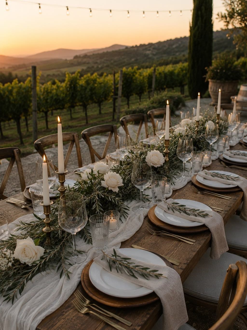
Olive branches laid as a runner need no floral foam, no pins, and no advanced technique: strip lower leaves so nothing sits in spilled water, lay them stem-to-tip, and nestle blooms or candles where the branches meet.
White roses at intervals keep the runner from reading as pure greenery; taper candles add height without blocking sightlines across the table. The vineyard setting here means wind is a consideration; indoors, taller candles work.
I would cut branches the morning of, since they wilt slowly but do wilt. For a budget version, grocery-store olive branches and spray roses on a bare wooden table need no runner underneath.
Timeless Color Combinations
Olive green carries enough yellow to feel warm rather than military, and burgundy sits low enough on the value scale that it reads as depth rather than shout.
Together they avoid the holiday trap that red and green fall into because both are muted.
Cream is the necessary third; without it, the palette closes in on itself. I have seen couples try to add a fourth strong color and the whole thing collapses into noise.
Gold works as a metal here for the same reason cream works as a color: it warms without competing. Silver would introduce a cool note that fights the olive undertone.
Seasonal Suitability
This palette belongs to autumn and winter because both colors already carry the low light of shorter days.
An August wedding with these colors can feel heavy unless the setting has open air and strong sun to lift them. Spring is harder still; the burgundy reads as last season’s holdover against new growth.
The cream and gold accents do more work in warmer months, reflecting what light exists. For a winter evening reception, the darkness of the palette becomes an asset; candles register more dramatically against deep tones than against pastels.
I would push the olive toward the lighter end of its range for a late autumn afternoon ceremony, since the sun drops early and full dark olive can turn to mud in shadow.
Floral Arrangement Tips
The florist’s greenery choice matters as much as the bloom selection. Standard eucalyptus reads blue-gray and fights the yellow in olive linens; olive branches or even rosemary carry the color story through.
A trial arrangement under the venue’s actual bulbs, not daylight, showed me both colors shift toward brown under warm dimmable LEDs.
For bud vases, single-variety clusters keep the look intentional; mixed stems in small containers read as leftovers from larger pieces.
Cohesive Wedding Theme
Coherence runs on repetition, not on matching every element exactly. The envelope-style invitation sets the palette; the menu card at each place repeats it at smaller scale.
I would carry the same olive green from the table linens to the place card stock, but not to every surface or the room goes monochrome. Burgundy belongs at focal points: the welcome sign, the cake ribbon, the bridesmaid dresses.
The eye travels to it because it is used sparingly. Gold appears where metal naturally belongs: cutlery, candle holders, perhaps the frame on the welcome sign.
Each guest should encounter the full palette before sitting down, so the table setting reads as arrival rather than surprise. The modern invitation website, if you are using one, should hold the same colors; digital is still a first impression.
Frequently Asked Questions
Does burgundy go with olive green?
These two colors share enough gray to sit together quietly, neither one pushing the other off the table.
Olive’s warmth comes through in its yellow base, while burgundy stays dark enough to act as a grounding shade rather than a competing accent.
The pairing skips the Christmas-cue problem because neither color reaches the brightness of true red or forest green.
Cream as a third color and gold as a metal warm the pairing further without introducing cool notes that would fight the olive undertone.
What color compliments burgundy for a wedding?
Olive green is a strong complement to burgundy for a wedding because the 2 colors share a muted quality that keeps them from competing. The yellow undertone in olive warms the pairing, while burgundy adds depth without shouting.
Gold flatware and candle holders carry the warmth forward; silver would drop a cool note into a conversation that does not need it. Cream works as necessary breathing room between the 2 darker colors.
What colors compliment olive green the best?
Burgundy and cream compliment olive green best, with gold as the supporting metal. Burgundy adds depth and focal points when used sparingly, while cream prevents the palette from closing in on itself.
A fourth strong color tends to break this particular balance, so holding to 3 keeps the table readable from across the room.