The ideas below run from a single gold accent, like diamond jewelry, up to a full hanging ceiling installation and a gold backdrop stage.
What decides which is yours is whether your venue lets you hang from the ceiling or only dress the walls and tables.
A ginkgo-leaf chandelier in matte brass warms a rented room without fighting its walls; a sequin ball gown needs a ceiling high enough that the skirt does not swallow the frame.
[link-whisper-related-posts]1. Champagne Colour Palette
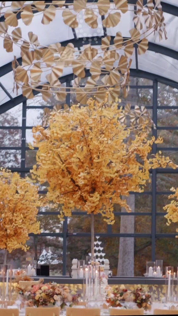
Champagne reads as gold softened by candlelight, which makes it forgiving in rooms that mix natural and artificial light.
I like it for couples working with rented venues where you cannot control the walls or the carpet, because champagne-toned linens and florals warm up whatever surrounds them without fighting for attention.
The mistake I watch for is letting the gold drift too yellow or too metallic. Pair champagne with matte brass or brushed bronze rather than high-shine finishes; ginkgo-leaf chandeliers work because their surface catches light without throwing it back hard.
Pearl jewellery sits naturally in this palette, its slight iridescence picking up the same muted glow.
If your venue has purple anywhere in its fixed decor, test it against your champagne samples under the actual lighting. A mid-tone purple against yellow-leaning gold will vibrate against itself and tire the eye within minutes.
2. Diamond Jewellery
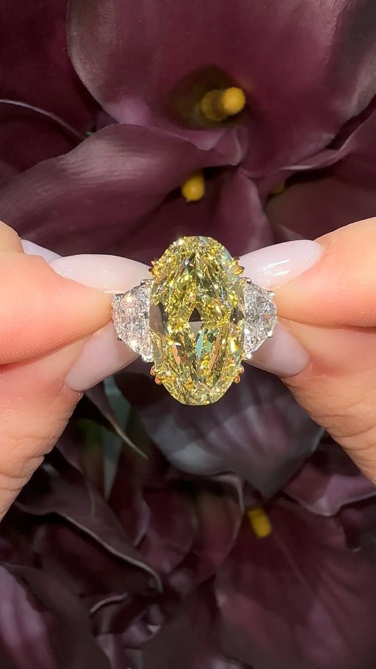
A yellow diamond warms up the traditional bridal set without leaving the precious-stone category entirely.
The oval cut spreads its colour across a larger face than a round stone of the same carat weight would, which matters when the gem itself is the statement.
I would build around one strong piece rather than scattering small diamonds everywhere.
A necklace, earrings, or bracelet in a simple setting lets the stone do the work; the champagne theme gives you permission to choose warmth over the colder white-diamond default.
Pearls pair well here if you want to layer, though I would keep metals consistent.
Heirloom diamonds borrowed from family carry the sentiment without the purchase. If you go that route, have the setting checked by a jeweler beforehand; older prongs loosen, and a wedding day is a bad time to discover it.
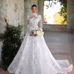
3. Bridal Gown with Champagne Undertones
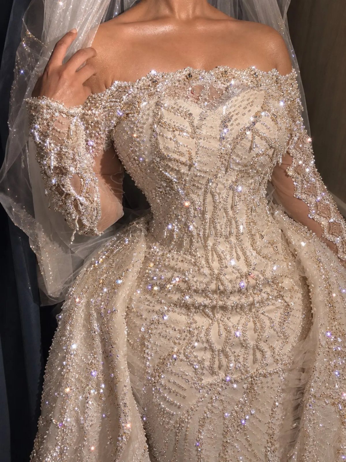
Beading and crystal catch light differently than plain satin, which is why a gown reads as gold rather than beige.
Off-the-shoulder sleeves widen the silhouette at the top; if you carry weight in your arms, the eye goes to the neckline instead.
Lace or metallic embroidery in champagne tones gives you the same warmth with less weight than full crystal coverage.
I would ask to see the gown under the store’s fluorescents and then near a window; champagne shifts more than ivory between light sources, and you want to know what your photographer will get.
For makeup, dewy skin and champagne-toned eyeshadow continue the tone without matching too precisely.
A soft pink lip keeps you from looking washed out in daylight. Jewellery layered above a sweetheart neckline works best if the pendant sits at the dip, not floating an inch above it.
4. Crisp White
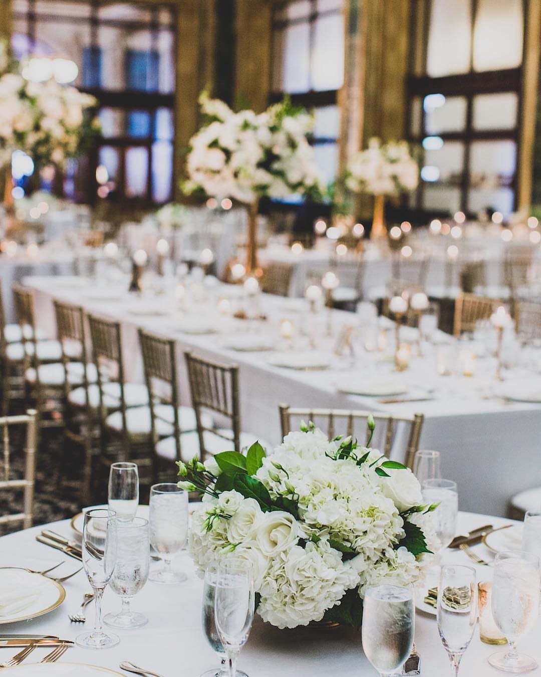
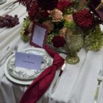
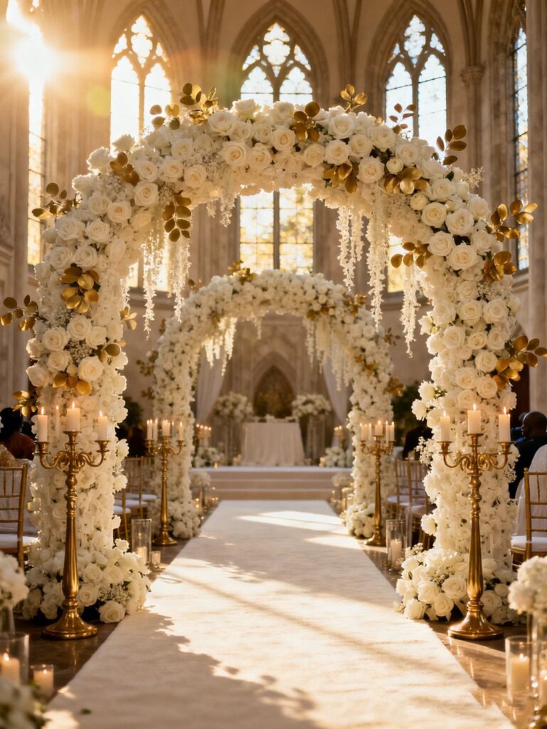
White linens and florals against gold chairs give the metal room to breathe. Chiavari chairs are a narrow frame; the white tablescapes dominate by volume, so the gold reads as accent rather than theme gone too far.
I would use this ratio anywhere the budget does not stretch to full gold replacement. White flowers in season cost less than dyed or gilded blooms, and the candlelight does the warm work for you.
Deep green enters as foliage, not as a third competing colour; eucalyptus, olive branches, or even bare winter stems against white keep the palette grown-up.
The limit is the chairs themselves, which most venues stock in white, natural wood, or gold.
If yours are none of these, chair covers in white linen cost less than replacing the whole look, though they read more rental-hall than the photographed setup.
5. Gold Sequin Ball Gown
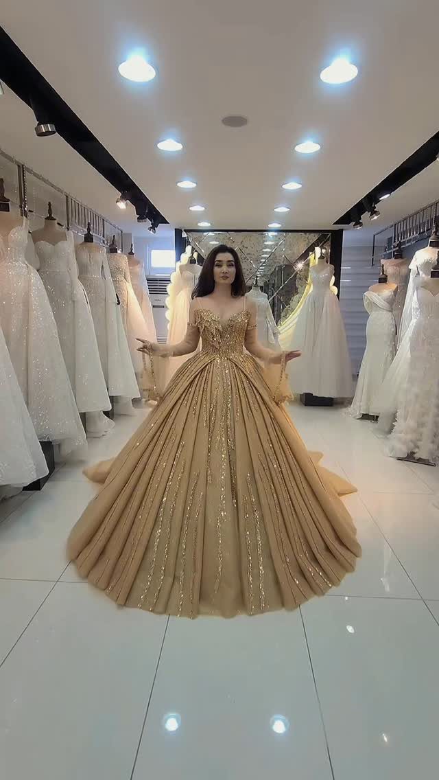
A gold sequin ball gown is not a subtle choice, and the woman wearing it knows it: she stands among white dresses deliberately, the only colour in the room.
The volume matters as much as the sparkle; this shape needs space to move and a venue with ceilings high enough that the skirt does not dominate the entire frame.
I would try this on last in any appointment, because the sequin weight changes how the skirt hangs and how long you can stand in it.
The beading adds structure but also pounds; ask to wear it for 10 minutes before you decide. Photography flashes bounce hard off sequin surfaces, so test with your photographer’s lighting if you can.
This gown suits a bride who wants the dress to be the memory guests take home.
It trades away the traditional white bridal entrance for something closer to Old Hollywood or costume drama, which is either exactly right or worth knowing before you commit.
6. Hanging Gold Ceiling Installation
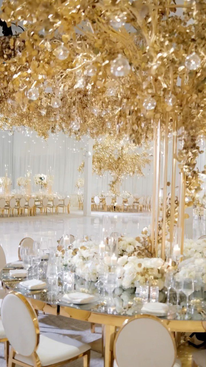
A ceiling installation on this scale turns the room into a set piece before guests arrive. Mirrored tables double the effect downward, so the gold reads as surrounding rather than merely overhead.
I would verify load limits with the venue before committing; floral and crystal trees this size need rigging points rated for more weight than standard drapery hardware.
The white florals at table level keep the installation from feeling like a golden cage. Without that grounded contrast, suspended gold can press down visually.
Check sight lines from seated height, not just standing; your guests will spend most of the reception in chairs, and an installation that frames the room beautifully from the doorway may block conversation across tables.
This setup suits a reception with a single long dinner rather than heavy dancing, because the rigging limits where lighting and other effects can go.
7. Gold Backdrop Wedding Stage
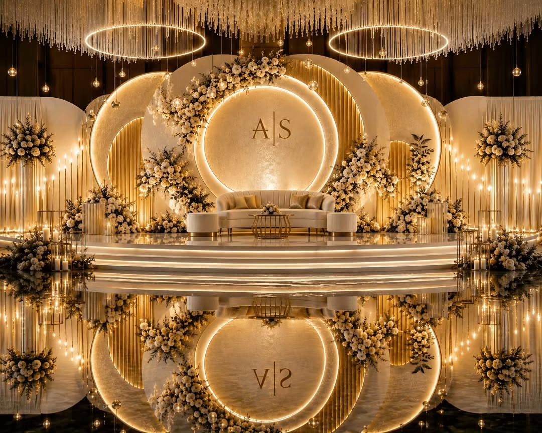
Circular frameworks layered at staggered depths give a stage its architecture without building solid walls that trap heat and sound.
Warm backlighting from LED strips set behind each ring needs dimming capability; full brightness after dinner reads as interrogation, not romance, so I would confirm that with the rental company.
A glossy floor doubles the structure visually but shows every scuff from setup through last dance. Protect it during vendor load-in, or budget for a buffer zone where the sofa sits.
The monogram placement at center reads as the couple’s mark only if the letters scale to the innermost ring; too small and they disappear, too large and the whole thing looks branded.
White upholstery on the sofa keeps the gold from becoming a metallic box. I would add nothing darker than greenery at the base; the photo’s pale florals maintain the upward lift.
This setup needs generous ceiling height to breathe, and it fixes your ceremony or sweetheart table in one spot for the entire event.
Choosing the Right Gold Tone
If the undertones mismatch, the table looks like 2 weddings sharing space.
Yellow gold carries a warmth that reads classic and old-school; champagne gold sits cooler and feels more current. Mix them and both look dirty.
A gown with silver undertones or florals with cool lavender notes will fight warm yellow gold rather than work with it. The fix is militant consistency, not more gold.
A smaller set of pieces that actually match beats a whole room of metals arguing with each other. A neon-yellow sprayed leaf against copper-leaning flatware is the mistake I watch for; both were called gold by their sellers.
Importance of Texture
Stop hunting for one shade of gold across every surface. Light hits satin ribbon, matte cardstock, and mercury glass differently, so perfect color matching flattens the room into something artificial.
I stick to a tonal family, 3 shades of the main color, and I put money where guests will physically put their hands. Cutlery and napkins do the heavy lifting; background pieces can stay matte and quiet.
Texture variation does the work that exact matching cannot. Let the materials differ; the eye reads the result as richness, not mistake.
Lighting Considerations
Gold has no light of its own. It only reflects what you give it, which is why uplighting choices matter more than most couples expect.
Warm white or amber uplighting lets gold glow.
Saturated purple washes, especially full-wall coverage, turn expensive centerpieces into muddy shadows. Purple pulls back visually; gold pushes forward and catches what light there is.
Together they produce brownish-gray. If colored light is unavoidable, pin it to specific architectural features and keep the table light warm and low.
The professional approach keeps purple in physical decor, not in the lighting that hits it. Remember your guests spend the evening seated; the light that reaches their eye level determines whether your gold reads as jewelry or as dirt.
Avoiding DIY Pitfalls
DIY gold projects fail most often at the finish.
Spray-painted eucalyptus dries neon; hand-gilded edges chip by the reception’s end. The gap between imagined and actual is wider with metallics than with any other color because gold shows uneven coverage and wrong undertones instantly.
I would test any DIY gold element under your venue’s actual lighting, not kitchen fluorescents.
What reads as warm champagne at home may shift yellow or green in ballroom LEDs. Finding that out during setup is too late; I build in a test run weeks ahead.
Where the budget forces a choice between DIY gold and rented professional pieces, rent the gold and DIY the greenery.
A flat white candle or a eucalyptus runner forgives imperfection. Gold does not.
Frequently Asked Questions
What are the trendy wedding theme colors for 2026?
For 2026, gold and champagne are the pairing to watch: champagne reads as gold softened by candlelight, warm without shouting.
White serves as the grounding contrast, while deep green enters only through foliage like eucalyptus or olive branches. Keep gold from drifting too yellow or too metallic, and treat purple as a tested accent rather than a competing color.
What does gold signify in a wedding?
Gold signifies wealth, prosperity, and luxury in a wedding context. The color pushes forward visually and catches whatever light is available.
What colors go with gold for a wedding?
White and deep green work with gold; purple and competing metallics do not. White linens and florals give gold room to breathe, while eucalyptus or olive branches keep the palette grown-up without adding a third competing color.
The author warns that purple against yellow-leaning gold vibrates against itself and tires the eye, and that mixing yellow gold with champagne gold makes both look dirty.