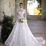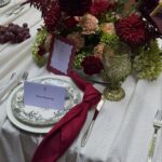
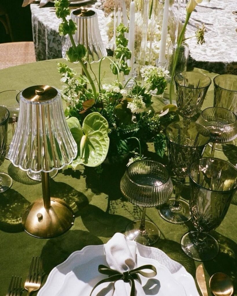
The thirteen greens here run from pale mint to deep forest, each with a season and setting it belongs to.
Your venue’s light does the real choosing: the same sage turns airy in a summer garden and flat in a sealed ballroom.
I would check any swatch against your venue’s actual fixtures or direct sun before ordering fabric, because a color that reads rich indoors can turn loud outside.
[link-whisper-related-posts]1. Emerald Green
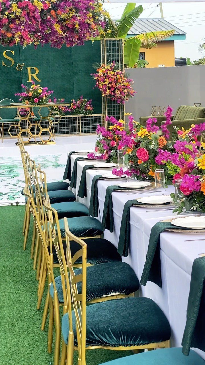
Velvet in this shade reads as instant evening formality, which is why I would limit it to napkins, chair cushions, or a single backdrop panel rather than dressing the whole room in it.
Warm, slightly aged gold settles emerald without competing; bright brass would fight the color instead.
For winter weddings, this pairing makes sense.
The emerald absorbs light where lighter greens would look washed out against snow or early dark, and the gold catches what artificial light you have. Copper works too, if you prefer something less polished.
If your venue runs warm in tone, tawny beige replaces gold without losing the depth. I would use that version for spring, outdoors, or anywhere the walls already carry color.
2. Mint Green
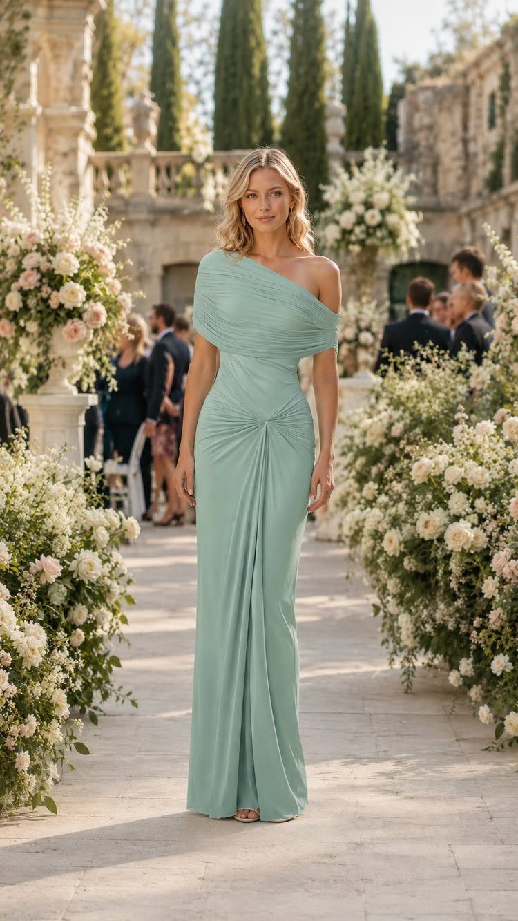
A cool green this pale needs something to keep it from looking like hospital scrubs, and gold is the right anchor.
I would use it in thin lines: jewelry, a metallic heel, the thin rim of a charger plate. Too much and you swing prom; too little and the dress floats away from the rest of the wedding.
This shade suits a glamorous theme because it photographs as intentionally chosen rather than default.
A one-shoulder cut adds structure to pale mint, which keeps the color from going flat. For bridesmaids, I would look for a similar detail: a strong neckline, a weighty fabric, something that keeps the color from looking accidental.
3. Sage Green
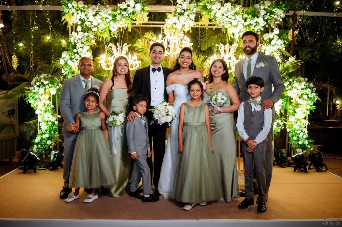
Bridesmaids in this tone stand slightly apart from the bride without competing, which is the job. Muted grey suits let sage stay quiet; navy or black would push the green toward costume.
At a rustic or outdoor wedding, sage looks like it was already there rather than placed. I would pair it with cream or champagne in linens and florals, keeping the green in living material: eucalyptus, olive branch, seeded grass.
The dusty blue variation I have seen lately softens everything further, but it needs a light-filled venue to keep from going muddy. A tent in high summer, yes; a barn in late October, probably not.
4. Green & Soft Blush
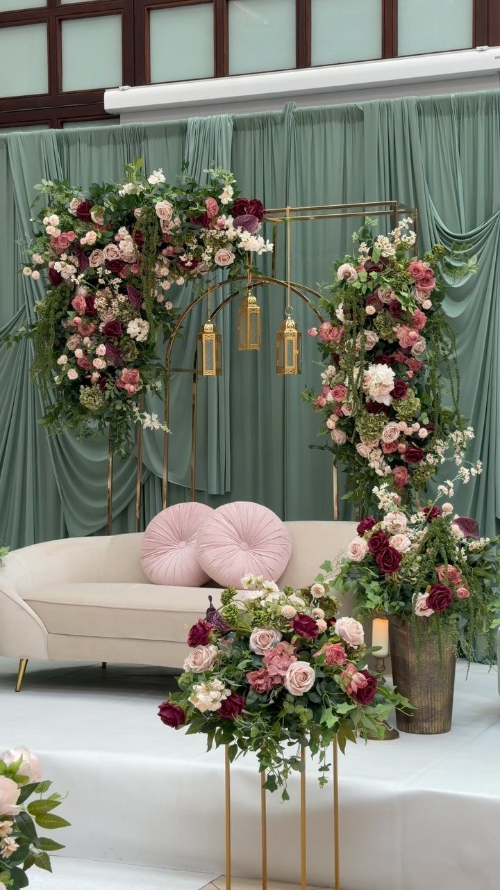
Green lives in drapes and foliage, blush in cushions and roses, and the balance between them is what holds.
I would keep the green as the larger field and the blush as the accent; reverse them and you risk a nursery palette.
Blush bridesmaid dresses with greenery bouquets give the soft look, but I would check the blush against skin tones first.
What reads as modest pink in fabric can turn orange or grey on the wrong undertone. The greenery bouquet is safer; it moves with the dress without matching it exactly.
A garden setting justifies hanging lanterns and curved seating without the arrangement feeling staged. Indoors, I would subtract one of those elements to keep the romance from tipping into set design.
5. Forest Green
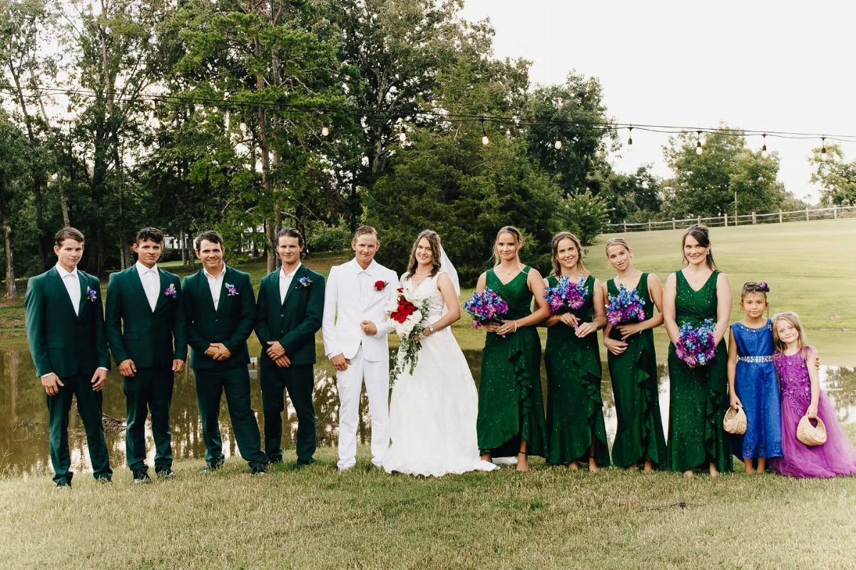
A wedding party dressed in this depth of green makes a statement that the couple in white then interrupt, which is the right hierarchy.
A forest green velvet ribbon tied around a simple bouquet keeps the color from going too somber; the depth of the green reads softer against skin than it would against white linen.
For fall or winter, this tone absorbs the available light and still holds its shape.
In summer, even in shade, it can look like a choice made for the wrong season. Mountain or woodland venues do half the work: the green echoes what’s outside and the whole thing feels intentional rather than transported.
6. Teal
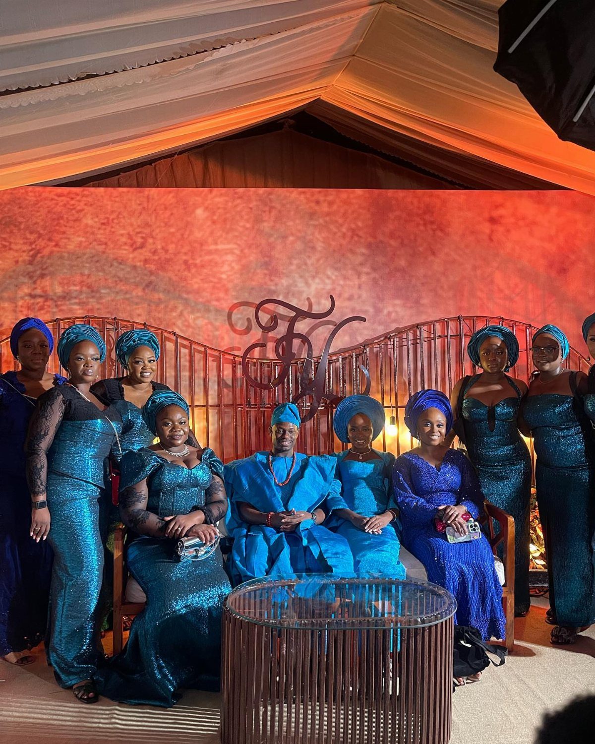
Saturated enough to carry detail without fighting it, teal solves the problem of a wedding party where each woman wants a different cut. Different necklines and sleeves on the same teal unify through color alone.
I would pair it with crisp white in summer, burnt orange or copper in winter, and either metallic or citrus depending on whether you want tension or relief.
The coastal gradient option, lighter seafoam against deeper teal, works for a beach or lakeside wedding but needs the water nearby to justify it. Without that context, the gradient reads as indecision.
7. Olive Green Terracotta Ceramics and Florals
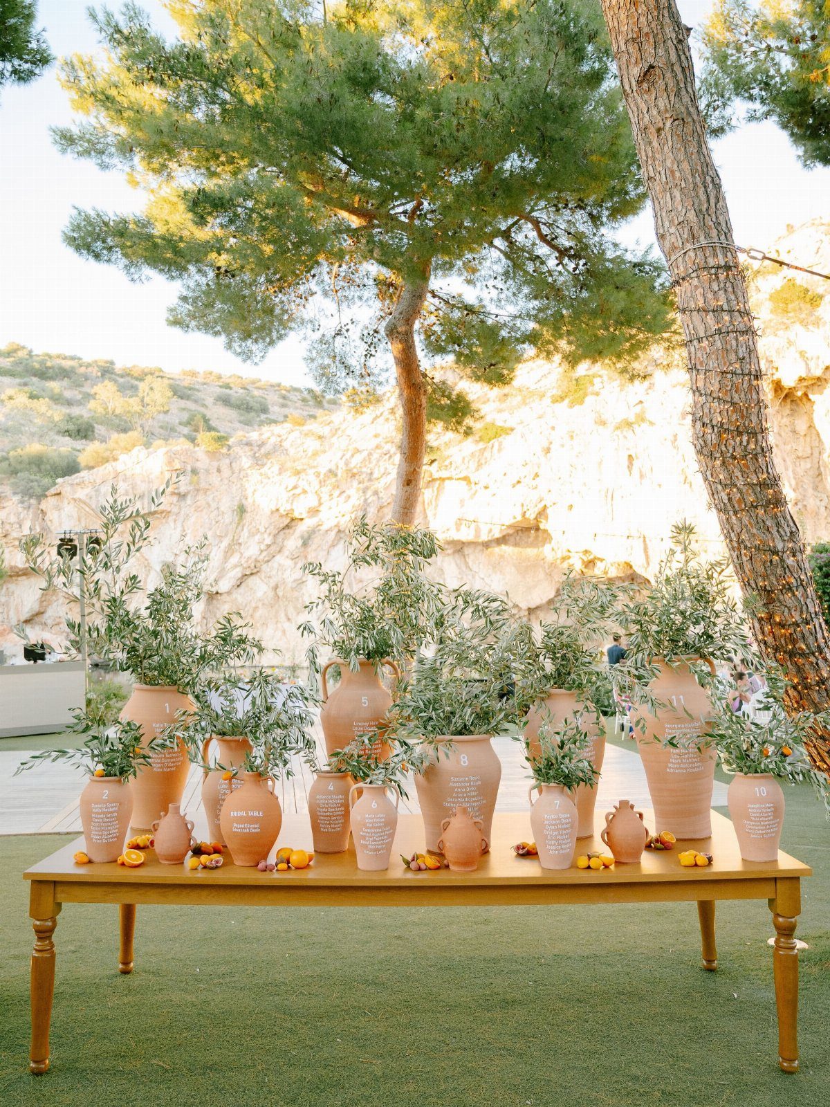
Terracotta urns and jugs filled with olive branches make a seating chart that guests actually stop to read. The clay warms the green without competing, and the whole thing belongs outdoors in a way glass or porcelain would not.
Late summer or fall weddings suit this pairing best; the colors feel borrowed from the season rather than imposed on it. Textured runners or linen underneath keep the table from looking like a showroom display.
I like terracotta and burnt orange blooms tucked in, but the olive needs to stay in charge or the palette turns autumn. Too many flowers and the arrangement turns festive in a way that fights the quiet tone.
Bohemian or nature-inspired couples land here naturally. The look trades polish for ease, which is a real choice.
8. Mismatched Green Bridal Party Dresses
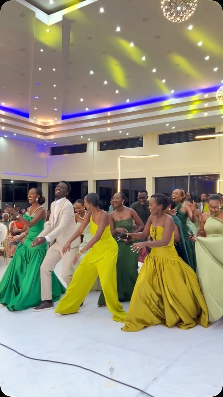
Letting each bridesmaid choose her own shade of green, from lime through olive to emerald, gives the group a living gradient that flatters more skin tones than any single color could.
The ombre effect in photos happens without forcing anyone into a tone that washes her out.
I would still set guardrails: same fabric weight, or at least same finish, so satin sheen does not sit beside matte chiffon.
Order swatches and check them in the light your venue actually has, direct sun if the wedding is outdoors, the hall’s fixtures if not. A color that reads rich indoors can turn flat or loud in natural light.
The unified look comes from the color family, not uniformity. Different necklines and cuts are the point; let them be.
9. Olive Green and White Tablescape
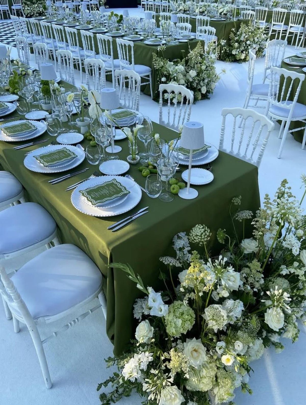
Olive tablecloths with white plates and white florals keep the green from going heavy. White carries most of the visual weight: the chairs, plates, table flowers, and petals drifting across the floor.
Check your venue’s light before committing. Olive absorbs more than it reflects, and a dim room turns it muddy where a tent or garden keeps it clear.
The green menus visible in the setup repeat the cloth without adding another color; I would keep that consistency rather than introducing black or gold text.
Spring and summer weddings suit this cleaner version of olive, when the green reads as fresh growth rather than late-season fade.
White flowers like roses or lily of the valley carry the formality; skip anything too tropical or too rustic in bloom shape.
Choosing the Right Green Palette
Season does more to narrow your green choices than most couples expect. The venue’s own palette matters too.
Walls that already carry warm color, tawny plaster or aged wood, push sage toward mud unless you add cream or champagne to lift it. Cooler spaces, white or grey, let the paler greens breathe.
Deep greens with gold read as evening formality; sage with blush reads as garden romance. I would decide which feeling fits the day, then test swatches in the actual venue light before ordering fabric.
Green as a Wedding Color
Green has this unusual flexibility at weddings: it reads as a color choice, but it also recedes like a neutral when you need it to.
It sits behind other tones without flattening them the way true beige or grey can, and it connects to the florals, wood grain, and outdoor settings that most weddings already include.
This is why it photographs with balance rather than competing for attention.
The versatility shows in what it accepts. Warm metals settle emerald; crisp white wakes up olive; blush softens sage without washing it out.
I have seen it paired with copper, terracotta, and even citrus, and the green held each time because it carries enough natural variation to absorb contrast.
The risk is choosing a green too close to your venue’s actual foliage, where the wedding palette disappears into the background. Test against the setting, not the Pinterest board.
Seasonal Considerations
I would reserve those tones for weddings after September.
Sage and mint need the opposite conditions. Their value is in airiness, which high summer light and outdoor settings provide.
Sage in particular relies on breeze and natural illumination to keep from going flat; the chiffon and mesh fabrics that carry it best move with air that a sealed ballroom may not supply.
A tent or garden ceremony gives the effect the color promises.
Floral Pairings with Green
Trailing greenery and herbs carry color without demanding the structure of a bloom, and they bridge the gap between table linens and the arrangements above them.
The floral choice shapes what green can do.
I would check any blush against actual skin tones before committing. The greenery is the safer constant; it varies naturally and forgives the mismatch.
Frequently Asked Questions
What is the best shade of green for a wedding?
Sage and emerald are the two most reliable choices, though the right green depends on your season and venue.
Sage works for rustic or outdoor weddings because it looks like it belongs there already; emerald reads as evening formality and needs gold or copper to settle it.
What are shades of green?
The main wedding greens are emerald, mint, sage, forest, teal, and olive, with dusty blue-green as a softer variation on sage.
Emerald carries the most weight and formality; mint is pale and cool; sage is muted and quiet; forest is deep and seasonal; teal is saturated enough to unify mismatched cuts; olive is warm and earthy.
Each accepts different pairings: emerald takes gold or copper, sage takes cream or blush, olive takes terracotta or crisp white.