Green wedding colors range from muted sage and olive to deep forest and emerald, and the sections below walk through how each shade behaves in real settings, from bridesmaid dresses to table settings to cake.
Spring gardens tend to pull you toward lighter greens that feel alive against budding leaves, while a fall or winter setting gives darker, heavier greens somewhere to land.
The sage green bridesmaid dress in the list below, photographed from behind with light running down the back seam, shows how this palette reads formal without stiffness.
[link-whisper-related-posts]1. Olive Green
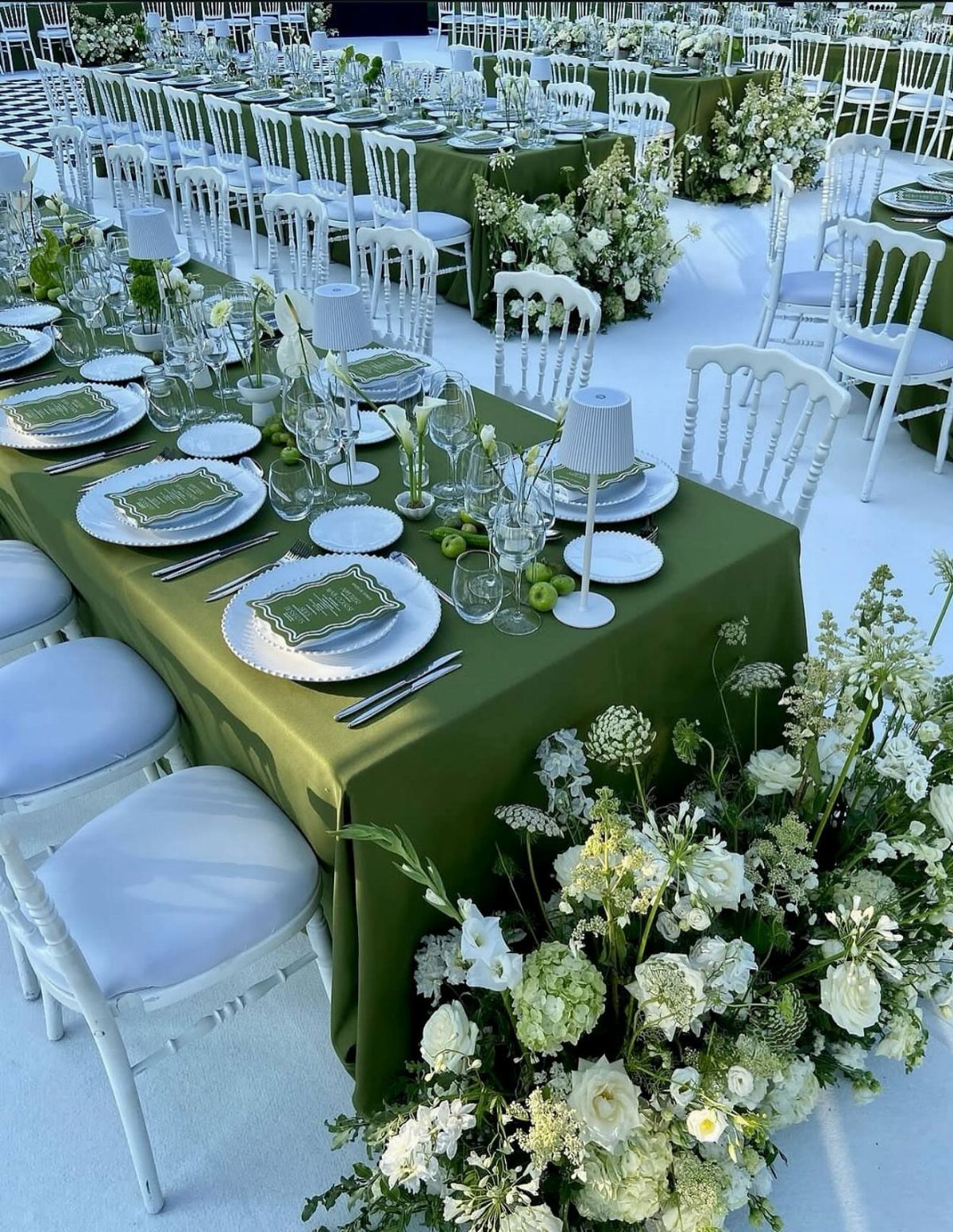
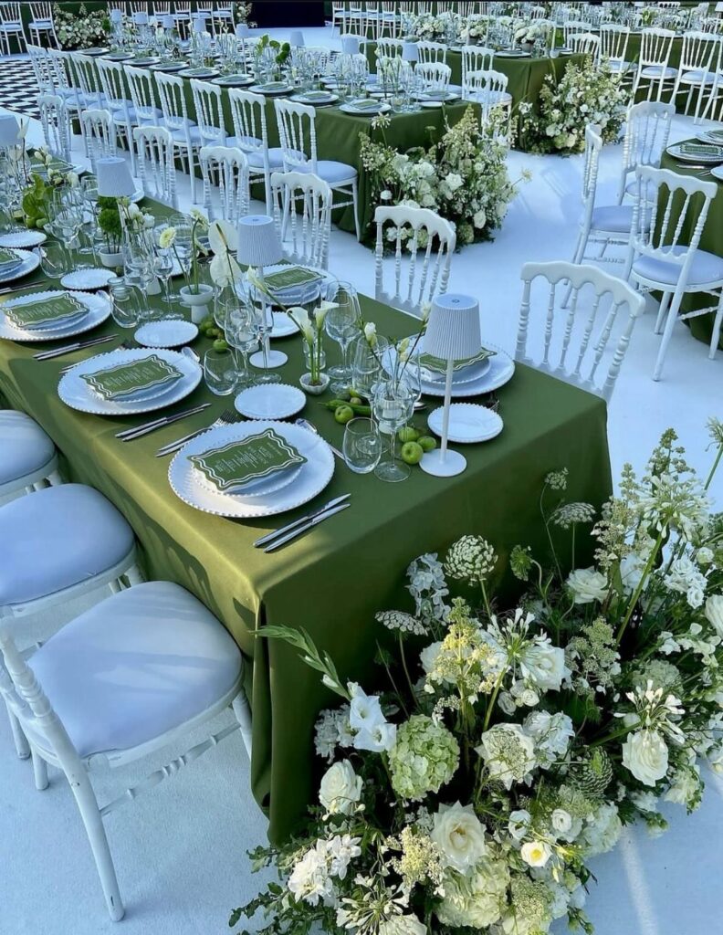
Olive green table linens work across every season without fighting the setting.
I like them best paired with blush pink or warm gold, though light brown keeps the whole look grounded in something natural. The color reads peaceful rather than loud, which matters when your florals are doing the heavy lifting.
White flowers against olive cloth photograph clean and bright. If your venue runs dark, add gold flatware or candleholders so the tables do not disappear after sunset.
2. Forest Green
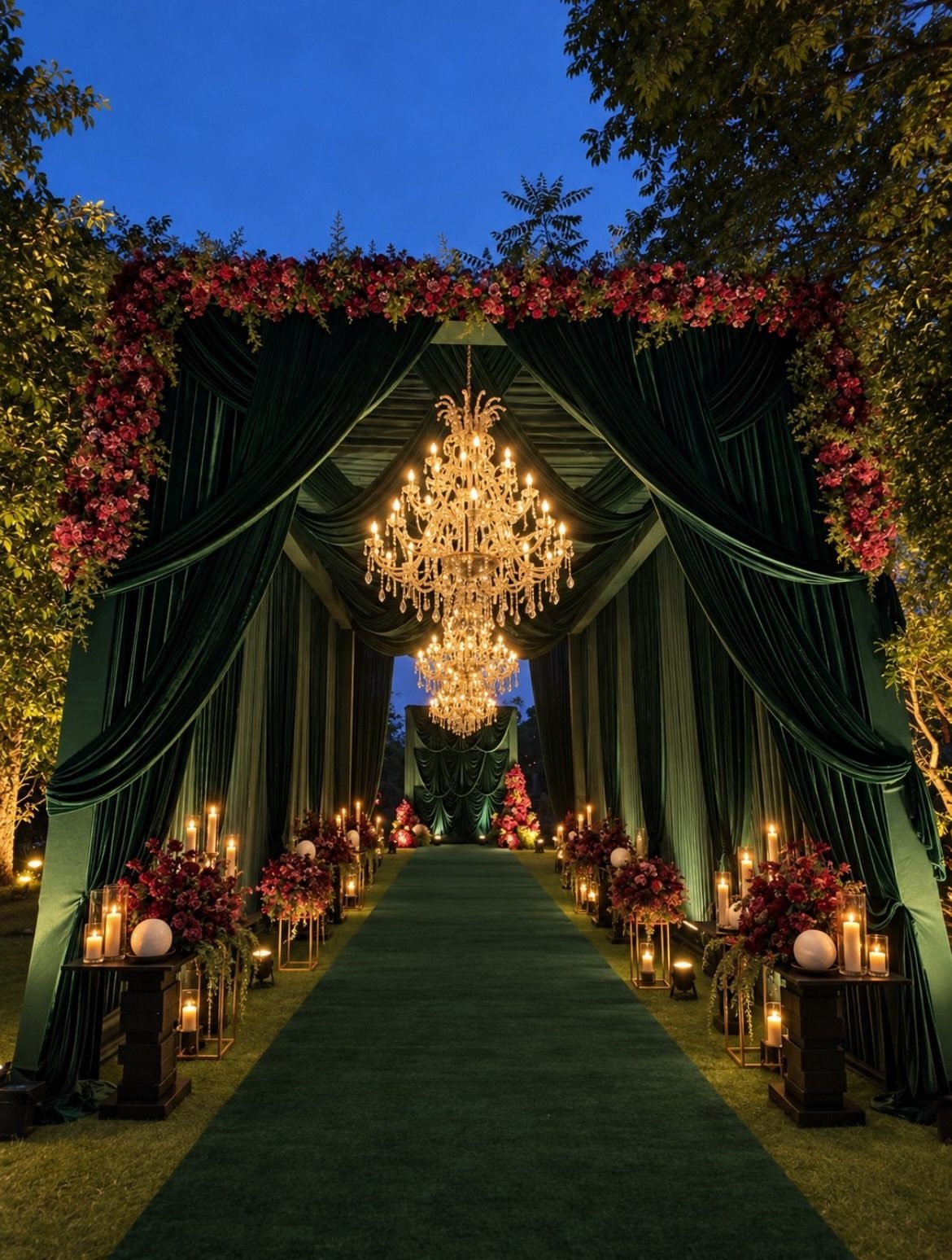
Forest green carries weight. Draped overhead as fabric or laid down as an aisle runner, it turns an outdoor evening ceremony into something that feels intentional rather than borrowed from the landscape.
I would use this palette for a fall wedding, where the deep tone makes sense against bare branches and early dark.
Pair it with cream rather than stark white, and let burgundy or wine-colored florals pick up the drama.
Forest green needs warm light to come alive; chandeliers and candles keep it from reading flat or gloomy. Check your venue’s lighting before committing.
3. Sage Green Decor and Gold Accents
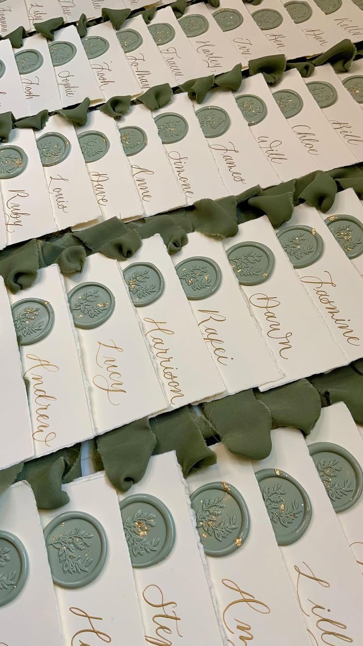
Gold calligraphy on hand-torn paper, sealed with sage green wax and gold flecks: the combination reads expensive without being loud.
A wax seal in sage green on white paper with gold foil turns a simple escort card into something guests pause over.
It slows down the opening, which sounds small until you remember guests handle these cards for only a moment and form an impression of the whole evening.
I would use this for escort cards or place settings rather than the invitation itself.
The ribbon tassel adds movement but is optional; the seal and the gold lettering carry the idea alone. If your calligrapher charges per piece, the seal lets you spend on fewer words.
4. Emerald Green and Gold Table Setting
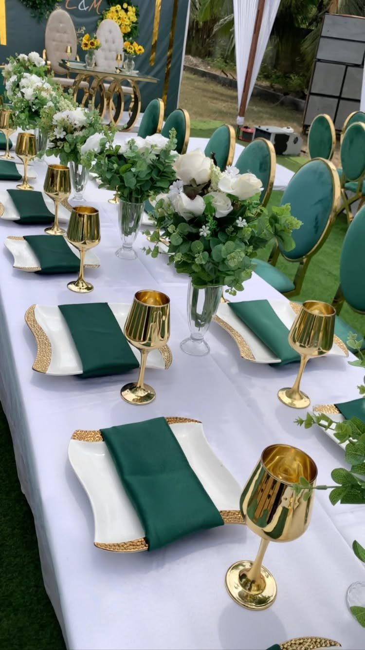
Emerald velvet chairs against a white cloth already state the case.
The napkins match the chairs rather than the table, which keeps the color from reading as random scatter. Gold goblets pick up the chair frames and add the warmth that emerald alone can lack.
This setup asks you to decide where the green lives: on the guests, in the linens, or in the furniture.
Doing all 3 works only at a venue that already owns the chairs. Rental velvet seating runs high, so if you are buying napkins and goblets instead, keep the chairs neutral and let the textiles carry the color.
5. Sage Green Bridesmaid Dress
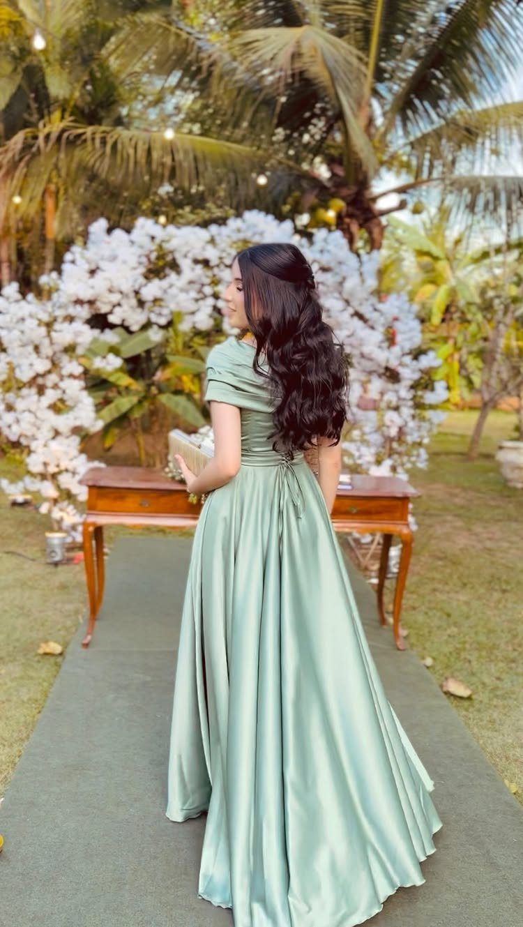
Sage green satin photographed from behind, the fabric catching light down the back seam: this is the color that sold me on green wedding palettes.
Satin reads formal without the stiffness of structured gowns, and an off-the-shoulder cut keeps it current.
Order fabric swatches before you choose. Satin sage and chiffon sage are different colors in practice, not just different textures.
If your bridal party mixes fabrics under the same color name, the result can look accidental rather than layered. I would put the whole party in one fabric, or assign fabrics by role and make the difference obvious.
6. Sage Green and Dusty Rose Bridesmaids
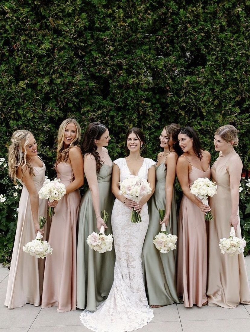
Mismatched sage green and dusty rose dresses, the bridesmaids mixed rather than blocked by color: this solves the problem of a bride who wants both tones but cannot choose. White bouquets unify what the dresses divide.
The champagne dress in the middle acts as a bridge.
Without it, the 2 colors can read as separate parties. If your florist is working with white flowers anyway, the bouquets become the neutral ground that lets the dresses speak.
I would keep the two colors in equal numbers, or let one shade dominate by a single dress so the mix reads deliberate.
7. Sage Green Wedding Cake
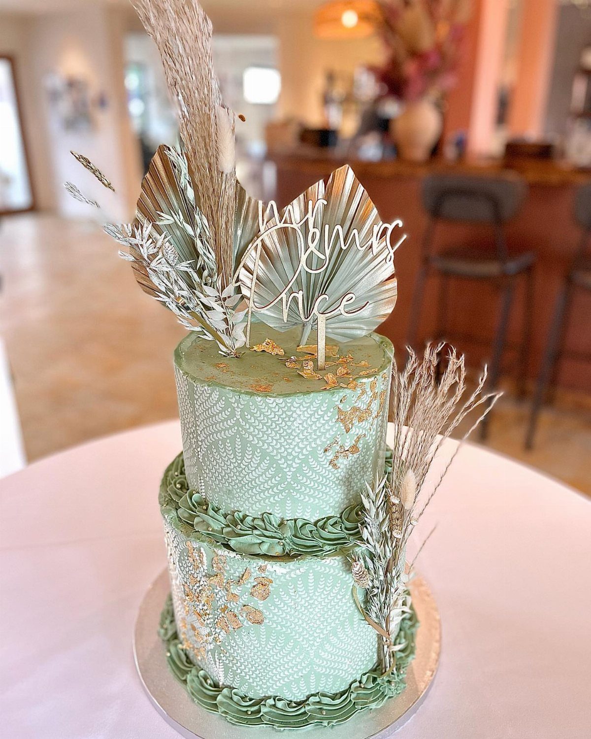
A sage green cake with gold leaf and dried fronds reads intentional rather than trendy. The two-tier size keeps costs down and serves a smaller guest list without looking skimpy.
Dried botanicals hold up longer than fresh, which matters if your venue sets up hours early.
Gold leaf is fragile; order extra or budget for a decorator who applies it on-site. The "Mr & Mrs" topper is replaceable with initials or a simple monogram if the wording does not fit your style.
Sage fondant photographs warmer than buttercream in the same shade. Ask your baker for a sample photo under your venue’s lighting before the final coat.
8. Sage Green Stationery Suite
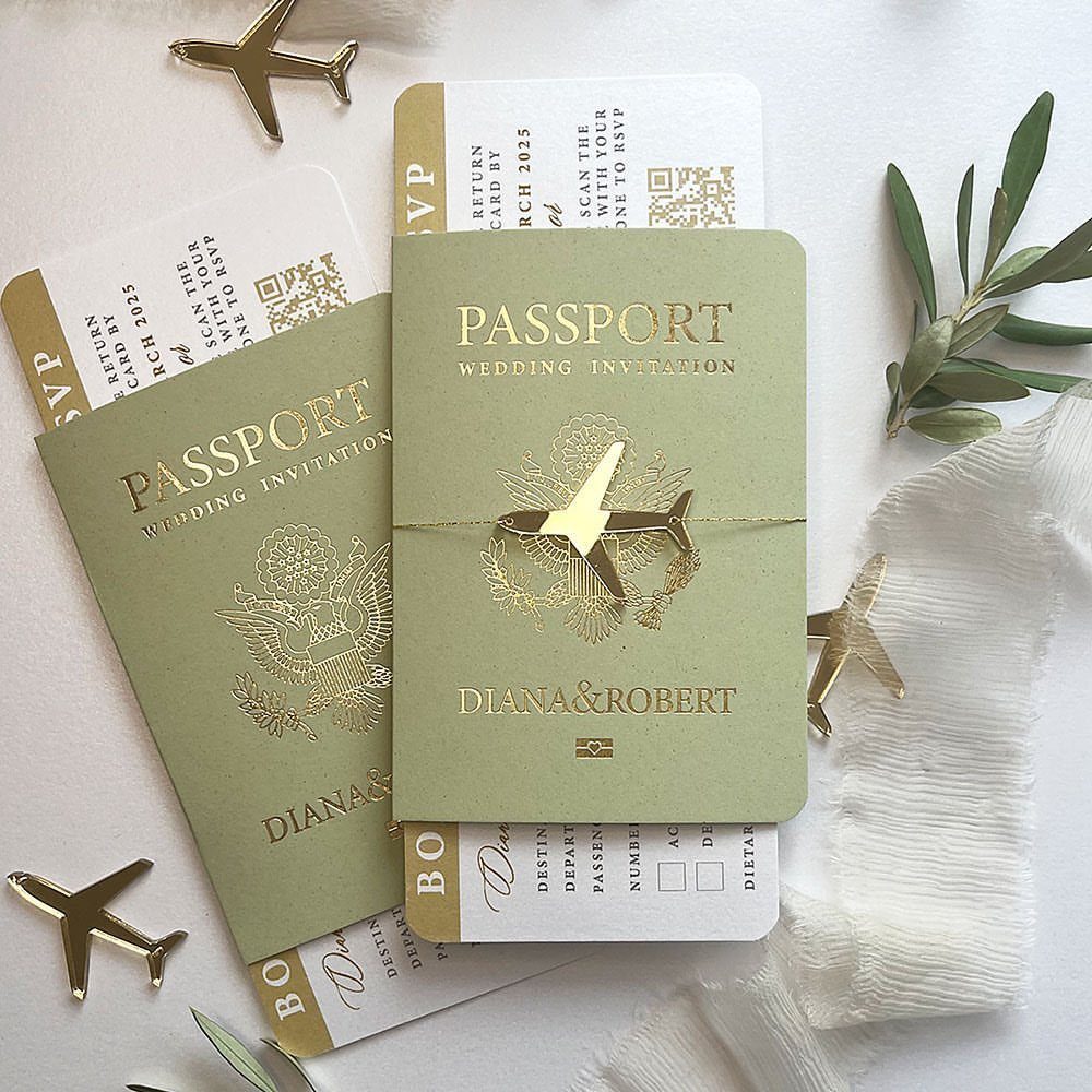
Passport-style invitations in sage green with gold foil boarding passes turn a destination wedding announcement into an object guests keep. The airplane charms and olive sprigs add weight and texture that standard cardstock lacks.
This format costs more per piece than flat printing, and assembly takes time if you are stuffing envelopes yourself. The boarding pass RSVP is practical: guests tear it off and mail it back, so the design earns its complexity.
Sage green here pairs with soft ivory or crisp white, and the gold foil picks up metallic accents you may already be using in table settings or jewelry.
If your wedding is local, the passport concept still works as a playful nod to travel you plan to do together, but the charm reads less essential. Skip it and let the foil and botanicals carry the idea.
Choosing the Right Green Palette
Start with the season, not the shade. A spring garden wedding asks for lighter greens that read fresh against new growth; fall and winter can carry the weight of forest or emerald without looking forced.
Your venue’s existing colors matter more than you think: sage against raw wood reads rustic, the same sage against marble reads formal, and neither choice costs extra.
Florals are where green either supports or competes. If your flowers are soft and unstructured, let a muted green fade behind them.
If you want architectural arrangements with tropical leaves or dramatic branching, a deeper green in linens or paper goods keeps the whole look from floating apart. The mood follows from those 2 decisions: calm comes from restraint, drama from contrast.
Green’s Versatility in Weddings
Green earns its place as a wedding color because it does not insist on being the point.
It reads as neutral in a way purple or orange never will, which means it can anchor a palette without limiting your other choices.
Wood tables, garden settings, stone walls: green connects to all of them rather than fighting for attention.
What surprised me in planning was how green accommodates change. A palette built on blush and sage can absorb burgundy if your florist finds late-season dahlias; emerald and gold holds steady if you swap roses for orchids.
That flexibility matters when you are ordering linens months before you lock in flowers. Green gives you room to adjust without starting over.
Photogenic Qualities of Green
Green photographs with a steadiness that brighter colors lack. It does not blow out in sunlight or disappear in dim rooms the way pastels can, which means your photographer spends less time compensating and more time catching moments.
The balance is literal: green sits at the center of the color spectrum, so it reads as neither warm nor cool unless you pair it that way.
The backdrop quality matters for group shots especially. Busy patterns or high-contrast palettes date quickly and distract from faces; green lets the people stay the subject.
For detail shots, green linens or paper goods give jewel tones and metallics something to push against without the whole frame turning into competition.
Seasonal Color Considerations
Emerald belongs to winter. The depth of it needs either snow outside or candlelight inside to come alive; in July sunshine it looks like a costume choice.
Velvet emerald in particular reads warm and weighty, suited to cold weather when you want the bridal party to look substantial rather than breezy.
Sage and olive cross seasons more easily because they are already muted. They work in spring with soft florals, in summer against sun-bleached grass, in fall with dried elements, in winter with cream and gold.
That range is useful if your date shifts or if you are buying decor online without seeing it in the intended season’s light.
Stretch crepe in emerald keeps the color for a sleeker look, cooler and less formal than velvet.
Both photograph with the same richness; the choice is what the fabric does in motion and how it feels against skin for hours of wear.
Frequently Asked Questions
What is the best shade of green for a wedding?
Emerald and sage green are the most popular choices, though olive, forest, and mint also have their place.
Sage works across every season and pairs with almost any palette, while emerald carries enough weight for formal winter celebrations. The right shade depends on your season and venue more than on trend lists.
Is sage green still a popular choice for weddings?
Yes, and its staying power comes from versatility rather than trend cycles.
Sage reads fresh in spring, sun-bleached in summer, earthy in fall, and quiet against winter cream. The risk is ordering fabric online without checking how the same color name shifts between satin, chiffon, and crepe.