The palettes below start with quiet neutrals like blush and champagne, run through saturated pairings like burgundy and gold or deep teal and pink, and end with a jolt of lime green that needs confidence to pull off.
What narrows the field is whether your venue already reads warm or cool, whether the sun will still be up when guests sit down, and which season is handing you its own colors for free.
Most palettes that hold together without fighting use three to five colors, with one quiet neutral doing the background work so the rest can stand out.
[link-whisper-related-posts]1. Burgundy and Gold
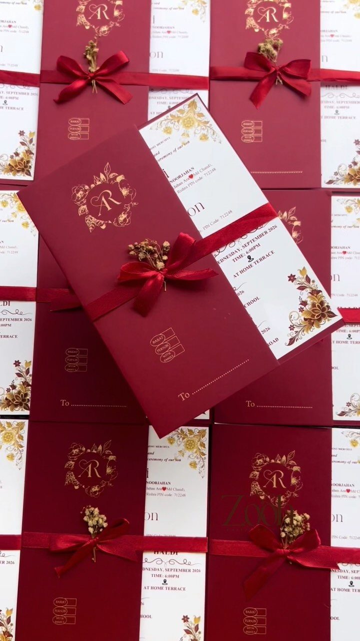
Deep burgundy and antique gold feel candlelit and intentional, not like someone left the Christmas decorations up.
I would use this for a fall or winter wedding where the venue already has some darkness to it: wood paneling, a tent at dusk, a room that takes color well.
The palette works because burgundy carries weight in every fabric.
Velvet catches light like nothing else for a winter reception. Chiffon moves better for dancing.
Satin sits in between. Mix them if your bridesmaids want different necklines.
Dusty rose and champagne soften the pair without diluting it. I would add those through flowers and table linens, not dresses, so the core stays moody.
2. Violet Bridesmaid Dresses
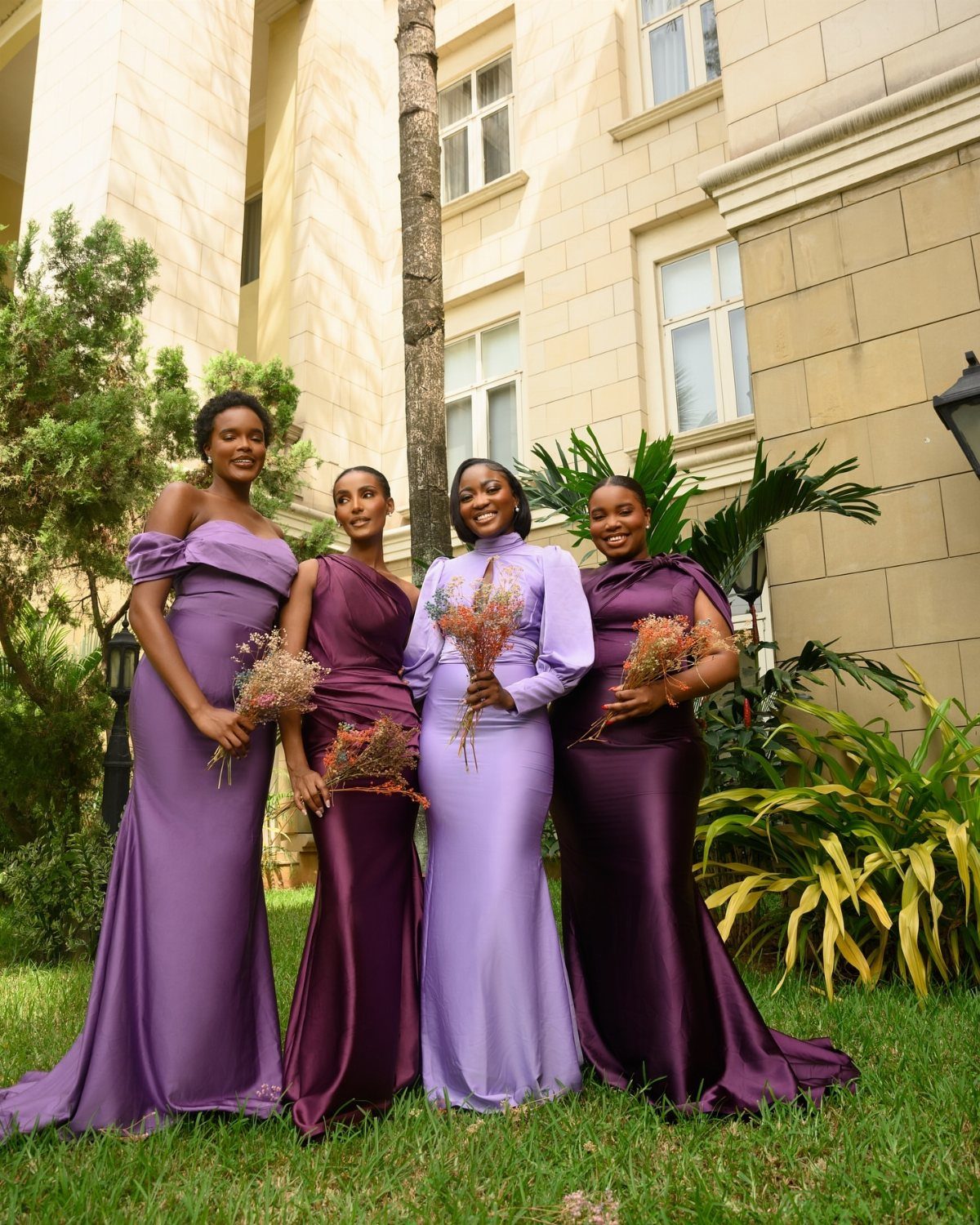
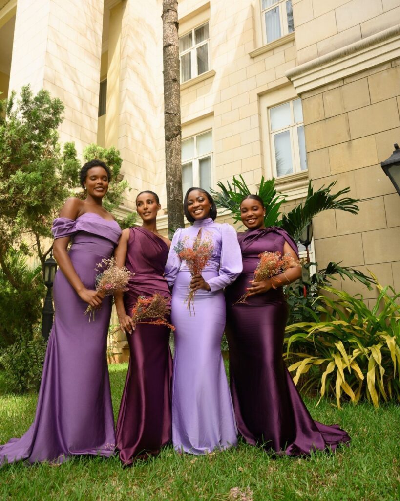
Violet sits cooler than the purples that trend toward red, which makes it easier to pair without looking like a grape soda commercial. Peach, light blue, and lavender all work alongside it, though I would pick one, not all three.
The color suits spring and outdoor weddings where you want something bolder than blush but still readable as pastel. In photos, violet holds its own against green backdrops without disappearing.
For flowers, actual violets are an obvious move but not a required one.
White or pale yellow blooms keep the look from going too monochrome. I would skip purple bouquets unless you want the bridal party to read as a single color block.
3. Mismatched Bridesmaid Dresses
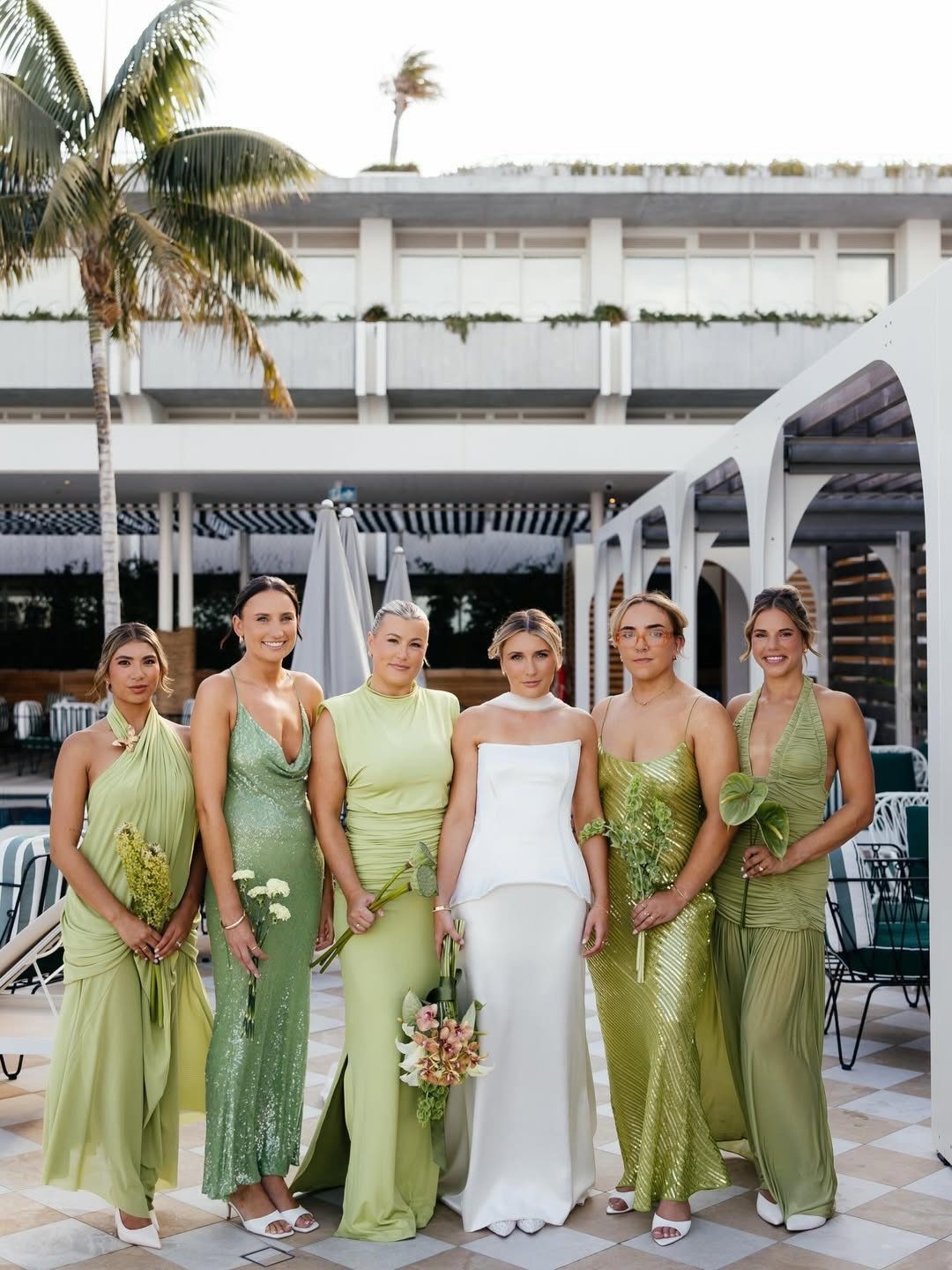
Letting your bridesmaids choose their own dresses sounds generous until you see versions of "sage green" that share only the word. The fix is narrower than you think: one fabric, two shades, and let them pick the cut.
Satin in sage and emerald, for example, looks intentional rather than accidental. The fabric ties them together; the shade variation adds depth in group photos instead of flat color-block uniformity.
I would set the rules before shopping opens: fabric first, then a palette of two to three colors, then necklines free.
Too many colors and you lose cohesion; too few and you might as well match. A good group photo pulls your eye across the whole line, not to the one dress that sits wrong.
4. Blush and Champagne
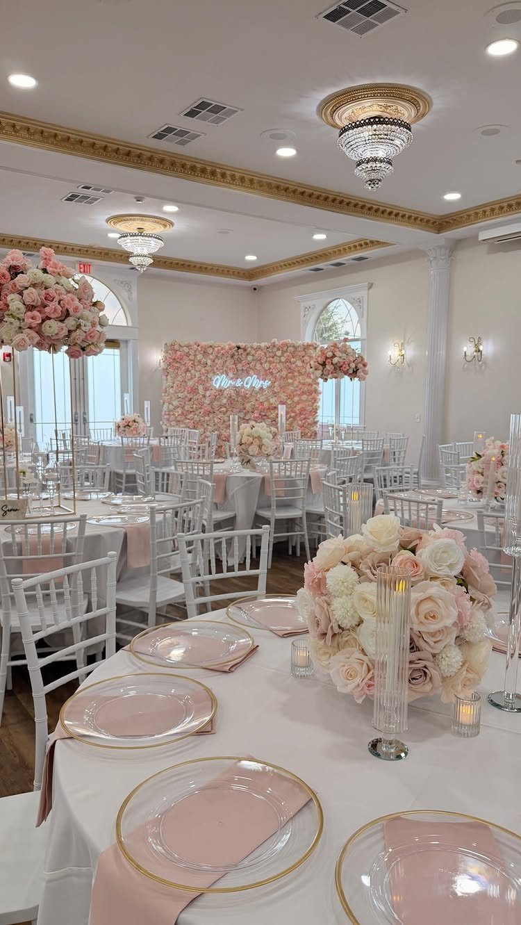
Petal blush and champagne together do the work of white without the formality. The pair reads soft in daylight and luminous under reception lighting, which is harder to achieve than it sounds.
Rose gold metalware, pearl-toned linens, and warm blush napkins layer without competing.
I would keep the metals consistent, all rose gold or all antique gold, not both. The palette has enough variation already.
This suits spring through fall and venues with natural light.
In a dark room it can wash out; add deeper blush in flowers or candlelight to ground it. For printed materials, champagne paper with blush lettering reverses the usual expectation and looks more expensive than it is.
5. Sage and White
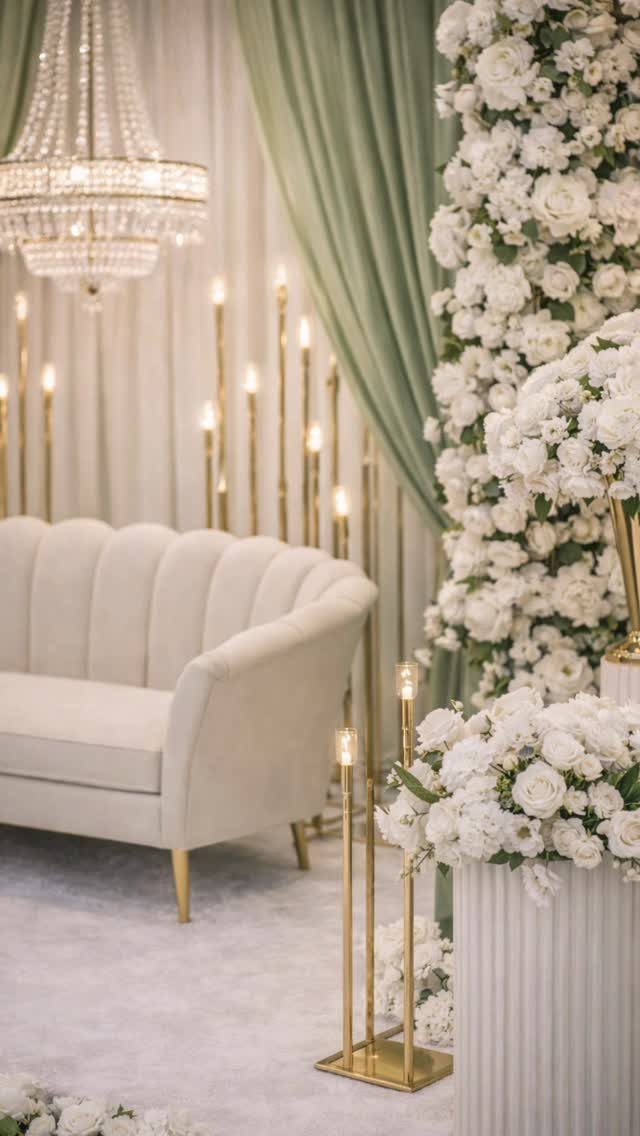
Sage and white carry the English garden idea without requiring an actual garden. The muted green keeps the white from reading as stark, and the white keeps the sage from going muddy.
I would use this for a spring or summer wedding where the venue has some architecture to soften: drapery, curved furniture, places for flowers to gather. Tall gold candleholders add warmth that plain white would not; the metal matters here.
Pale moss and warm cream extend the palette for flowers and linens without introducing a new color.
I would avoid anything brighter than soft white; restraint is what makes the palette work. Velvet in sage works for winter, but this palette really wants chiffon or silk in warmer months.
6. Emerald and Gold
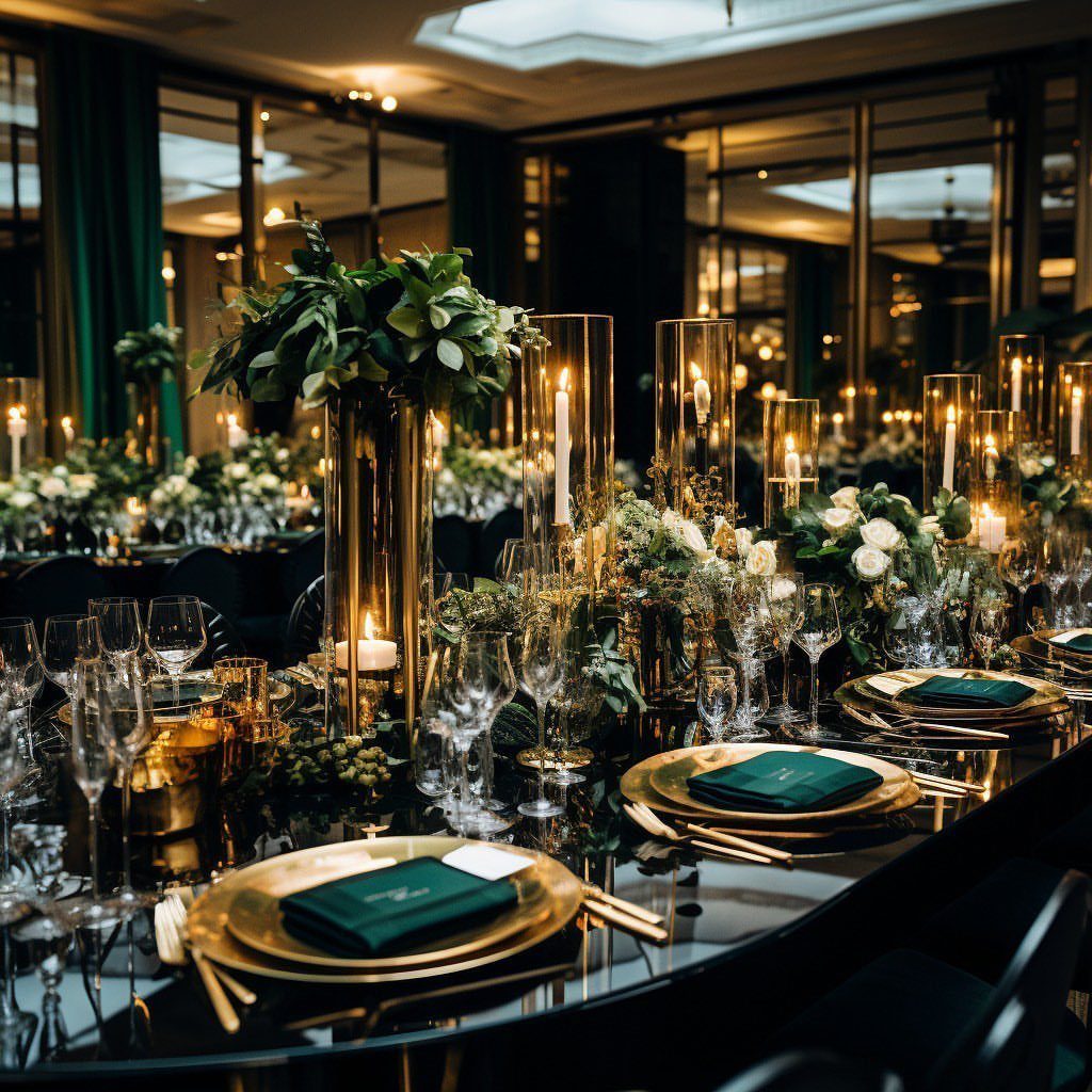
Emergreen and antique gold carry old-world weight that needs a venue to match. A modern loft or beach tent fights the palette; a ballroom, a historic house, or anywhere with existing wood and molding gives it somewhere to land.
The jewel tone reads lush rather than bright.
Deep forest and ivory extend the range for flowers and table settings without breaking the formality. I would use ivory, not pure white, for table linens; the warmth matters against the green.
Champagne in glassware and candlelight softens the edge that emerald alone would have.
This is not a casual palette. It photographs dramatically but punishes shortcuts: scuffed gold chargers or cheap green napkins show immediately.
7. Olive Green Bridesmaid Dresses
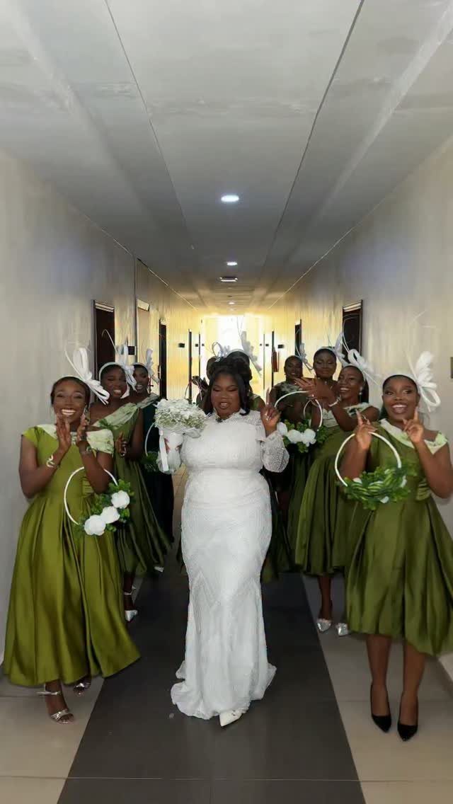
Olive green satin reads as intentional earth tone rather than costume. The color carries enough yellow to warm a fall wedding without drifting toward brown, and the satin finish keeps it from looking like utility fabric.
White and tan flowers keep the palette quiet; dark burgundy or plum push it toward boho.
I would pick one direction, not both. A small fascinator on each bridesmaid adds the formality that bare heads would miss, and it costs less than a full fresh-flower crown.
This suits September especially, when summer heat lingers but fall color starts to feel right. The green photographs well against stone, wood, or late-season grass.
8. Dusty Blue and Ivory
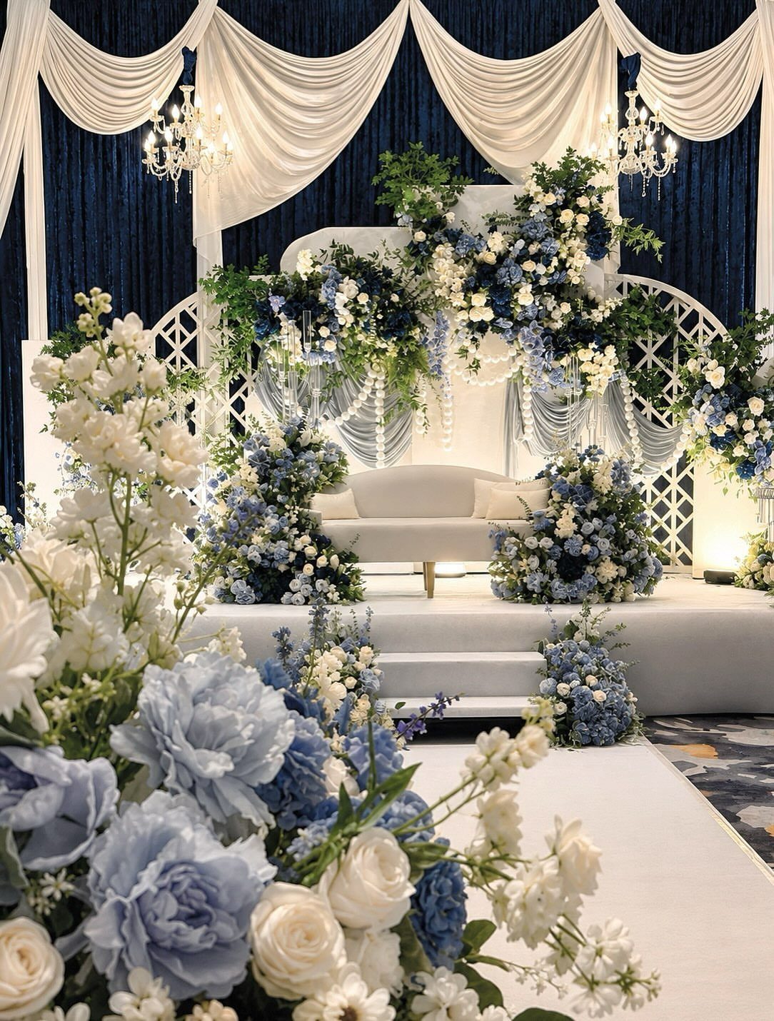
Dusty blue carries enough gray to stay calm in large amounts, which matters when it covers drapery and flowers both.
Warm ivory keeps the blue from going cold; silver sage extends the range for greenery without introducing a new color family.
I would use this for a venue with existing white architecture or drapery, where the blue has something soft to land against.
The palette works across seasons but wants controlled light: too much sun and the dusty quality washes out, too little and it goes gray.
9. Terracotta and Cream
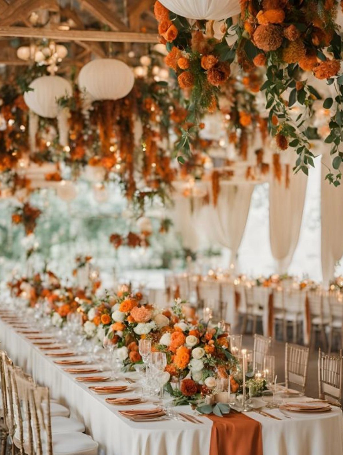
Terracotta and cream carry the warmth of baked clay without the sweetness of brighter orange. A terracotta runner anchors the table while cream linens keep the overall effect light; reversing that ratio would darken the room fast.
Burnt sienna in candles or glassware extends the range, olive in greenery keeps it from going monochrome. I would skip true red entirely; it fights the muted quality that makes this palette work.
Hanging installations repeat the table colors upward and matter more in a long room with high ceilings.
Late summer through fall is the natural window for this pairing, and it works best in venues where wood or stone are already part of the architecture.
10. Cinnamon Bridesmaid Dresses
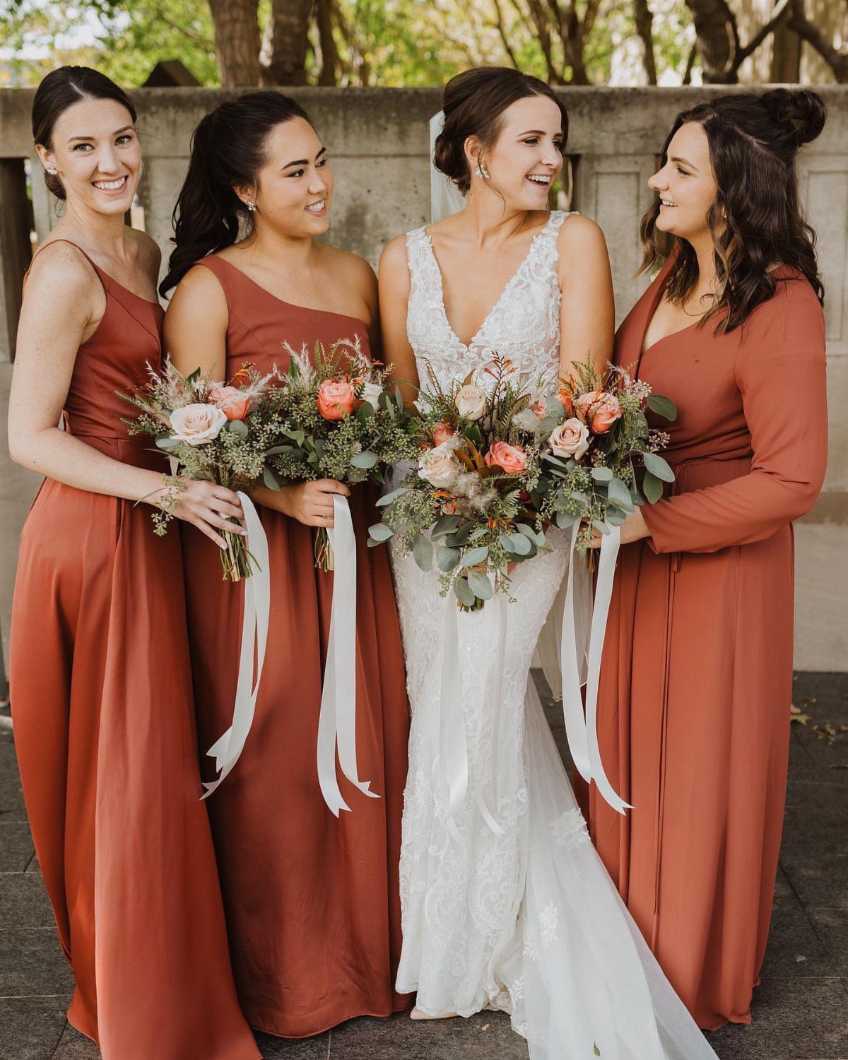
Cinnamon sits between rust and true orange, bright enough to read as energy without tipping into costume. The shade suits fall specifically because it belongs to that season’s leaf color rather than competing with it.
I would keep the rest of the palette restrained: cream or ivory flowers, natural greenery, maybe a touch of deeper burgundy. The bridesmaids carry the color; surrounding details should quiet down around them.
This works outdoors against October trees or indoors where the walls are neutral.
In a venue with strong existing color, cinnamon fights for attention. Check the space before committing.
11. Warm Neutrals Wedding Colors
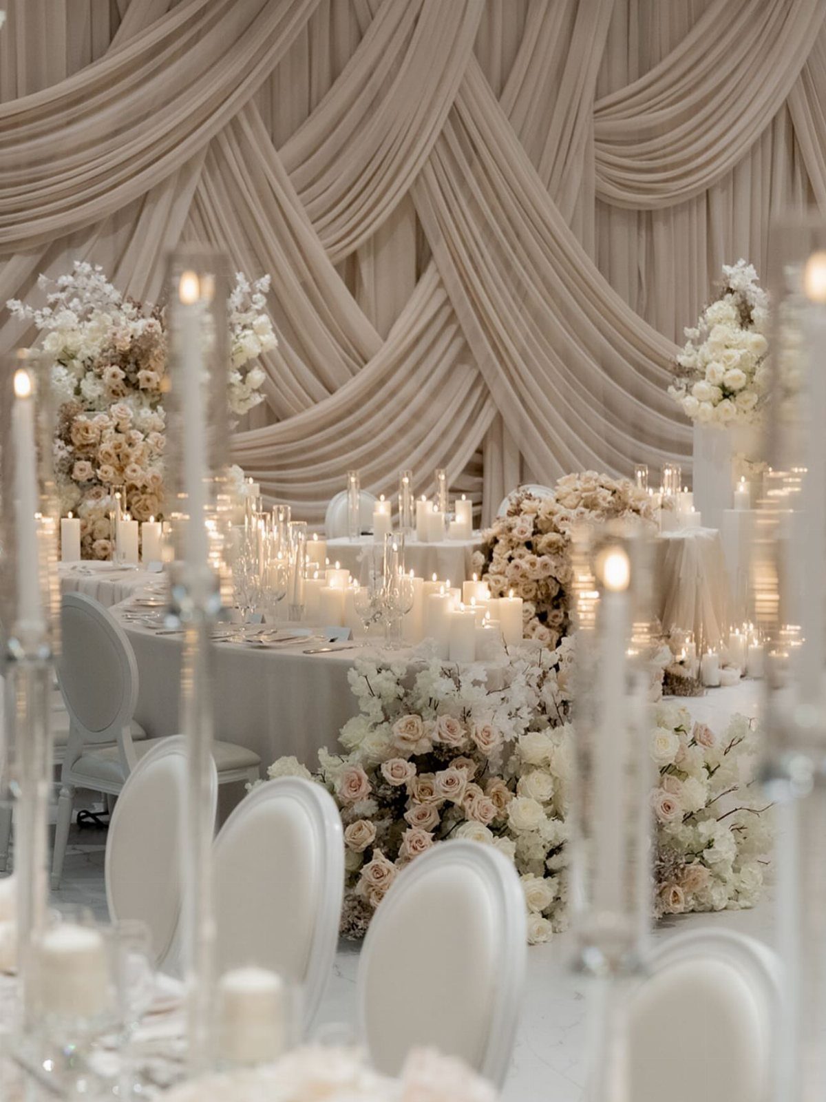
Warm neutrals trade the crispness of black-and-white for something more forgiving. Blush, cream, beige, and warm gray layer without a single sharp edge, which helps in a ballroom or tent where hard contrasts can feel severe.
Draped fabric adds texture that flat color would miss, though renting enough to cover plain walls will run up the linen bill. Candlelight matters here more than in bolder palettes, since the colors themselves do not carry the room.
I would use this where the architecture is simple or where the view outside matters more than the decor inside. It recedes rather than announces.
12. Black Tie and Ivory
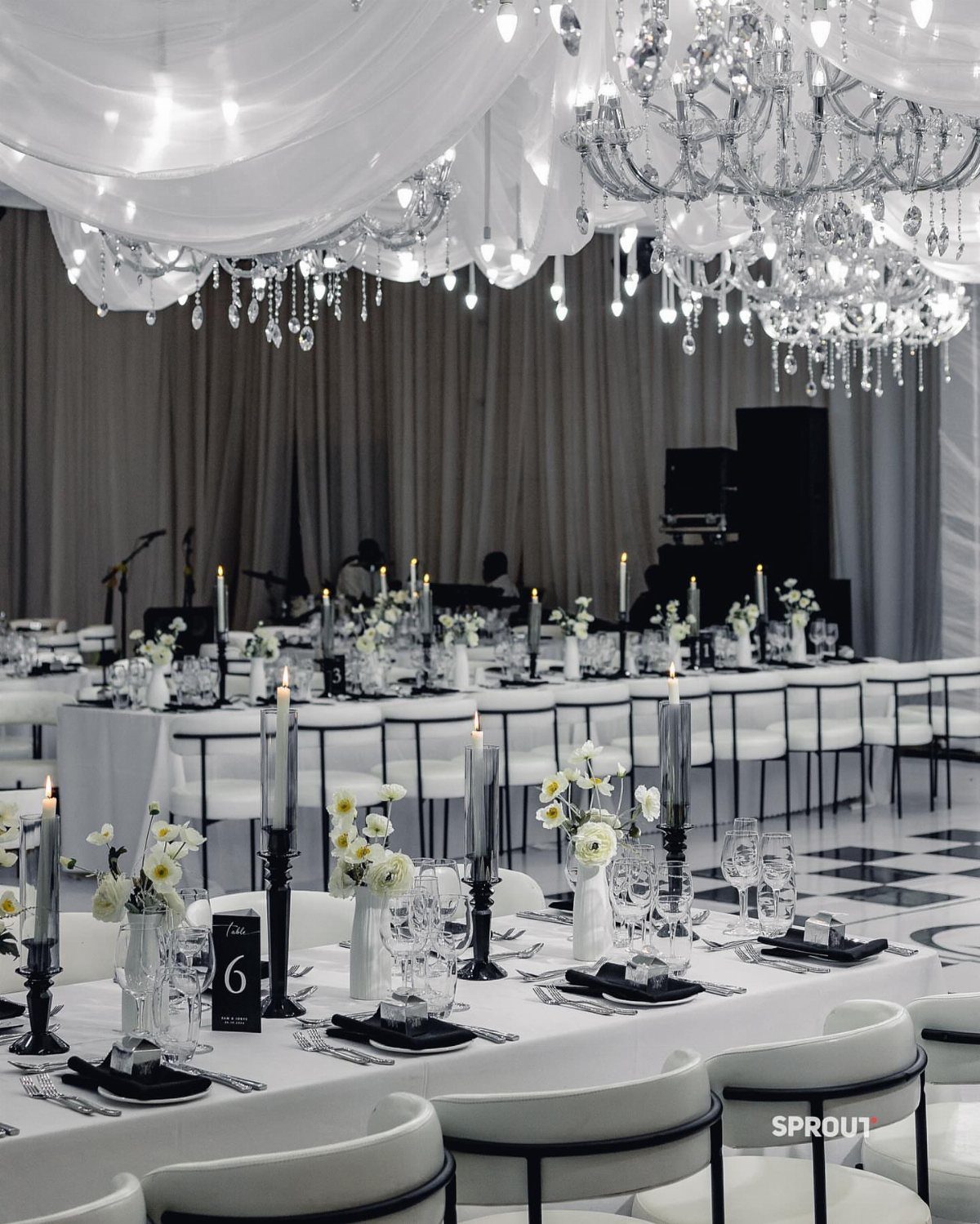
Black tie and ivory is not black and white. Ivory linens and deep cream warm what would otherwise read as stark; charcoal and soft black carry the formality without the harshness of pure black against pure white.
Black in candleholders and flatware keeps the palette restrained, with champagne gold only where you want a single metallic note.
I would keep it consistent, not mix silver, and use it sparingly. The chandeliers and draped ceiling do enough work already.
This palette demands a venue that can carry it: high ceilings, existing grandeur, space for long tables. In a small room it can feel like dressing up a space that refuses the part.
13. Regency Blues and Purple Hues
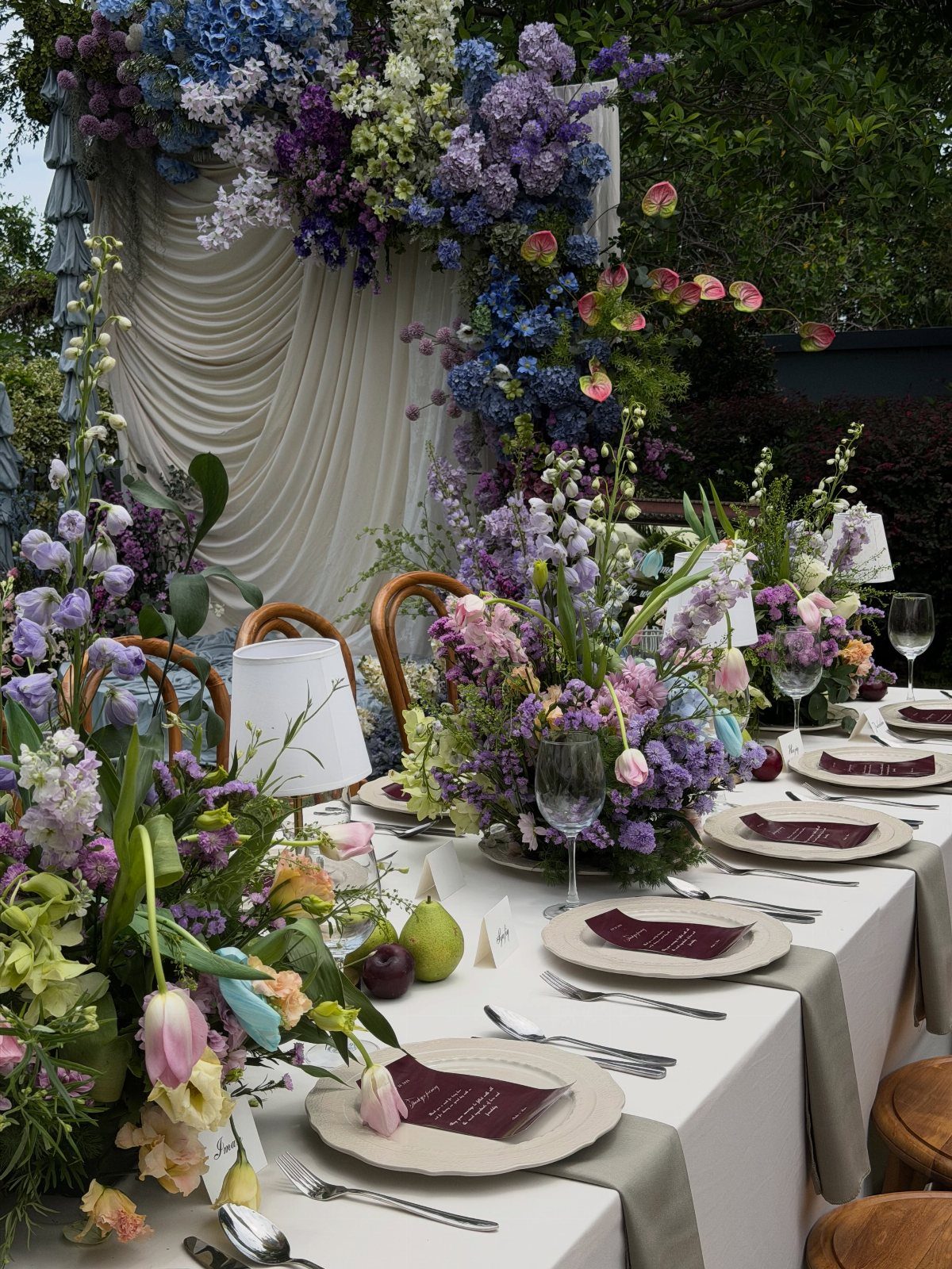
Regency blues and purple hues carry the candlelit formality of late 18th-century portraits without requiring full costume drama. The palette suits a couple who wants color that reads as history rather than novelty.
I would keep the china and glassware vintage-inspired but not matching; slight variation in pattern keeps the table from looking rented. A single warm accent, like dark red on paper goods, keeps cool blues and purples from going flat.
Mulberry or deeper violet in small accents, a ribbon or a single bloom, extends the range without diluting the core.
This palette wants a venue with existing architecture: tall windows, plasterwork, somewhere for the eye to travel. In a plain tent it can feel like color without context.
14. Mauve Satin Bridesmaid Dresses
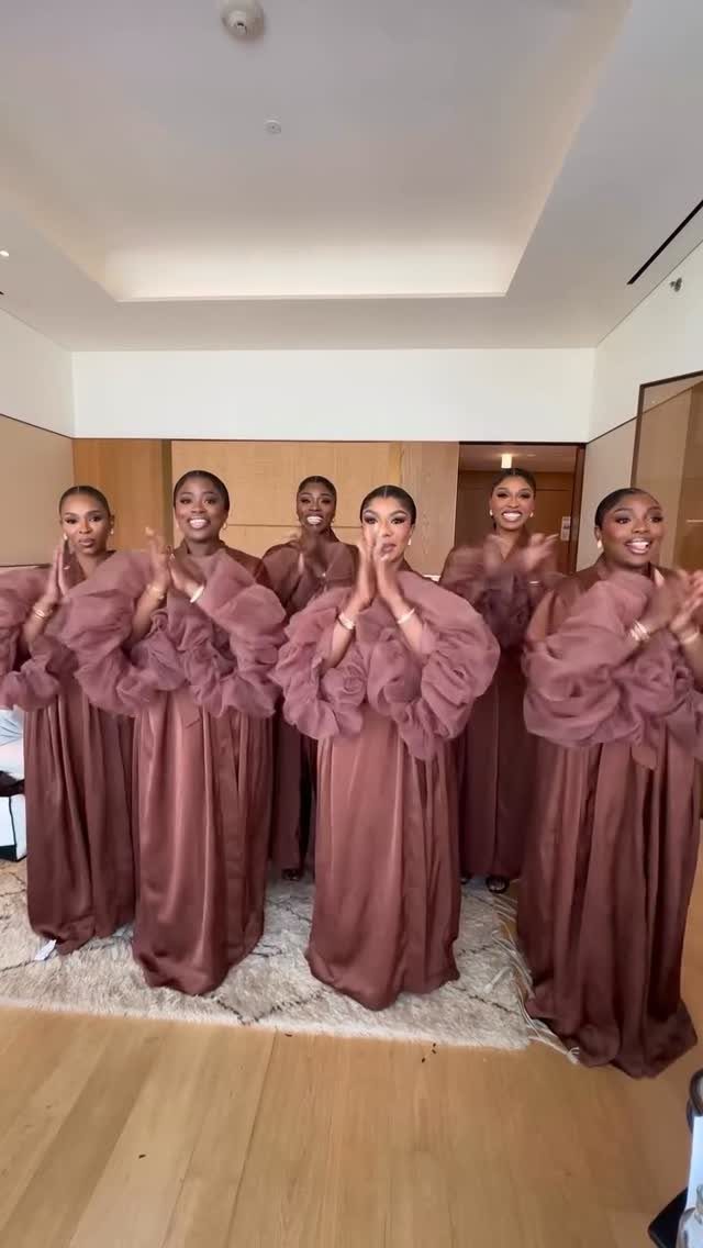
Mauve satin with ruffled sleeves is a specific choice, not a default. The fabric and the volume together read as occasion rather than everyday; one without the other would land differently.
For a bride considering this, I would think about the season first. Satin in August outdoors holds heat and shows sweat; the same dress in October carries light beautifully.
The ruffled sleeve adds drama in photos but can tangle in hugs and buffet lines; a smaller ruffle or a detachable version trades some impact for practicality.
The color itself sits between blush and true purple, which makes it easier to pair with neutrals than either of those.
15. Lavender Bridesmaid Dresses
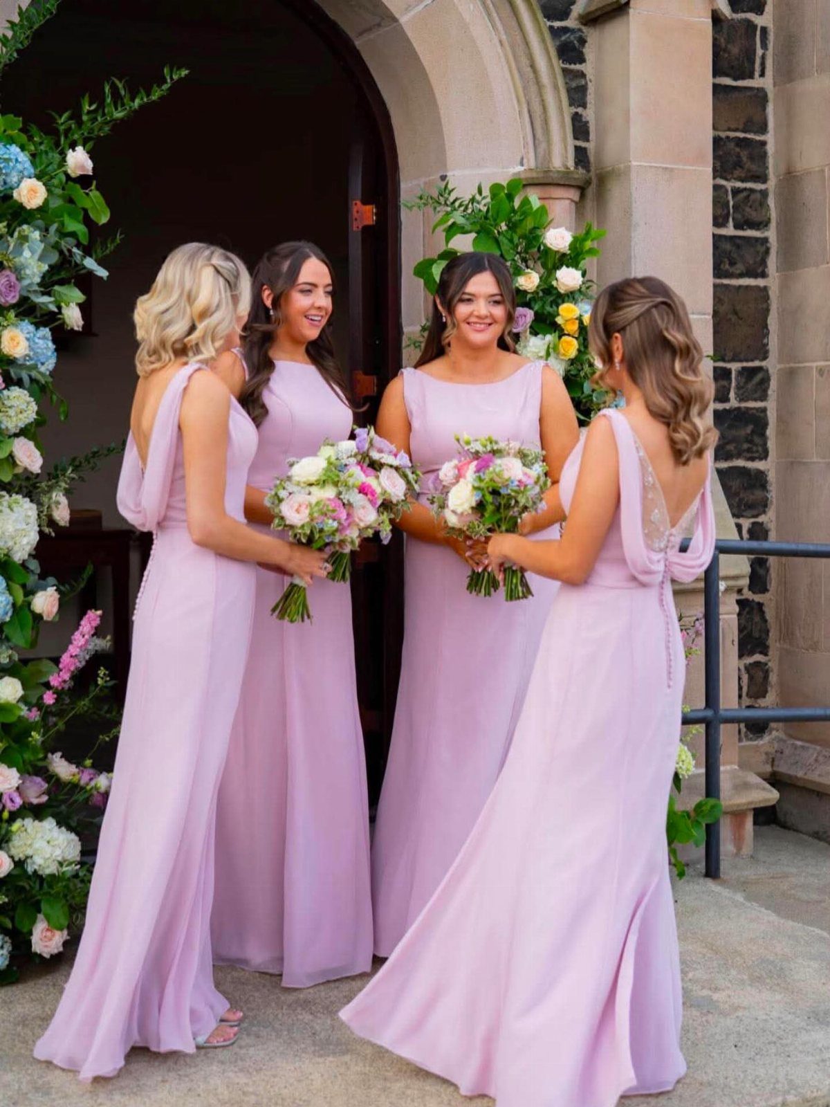
Lavender bridesmaid dresses against stone read as spring even before the flowers arrive. The color is light enough to photograph well in shade, which matters for church doorways and garden corners where direct sun never quite reaches.
I would use this for a daytime wedding where the reception continues outdoors.
The dresses carry enough color for the ceremony but do not fight natural settings. For flowers, white or pale yellow keeps the look fresh; deeper purples can make the bridal party read as a single lavender mass.
Chiffon or light crepe moves better than satin for outdoor processions, catching the breeze instead of fighting it. I would avoid heavy fabrics that weight the color down; lavender in velvet reads as costume, not choice.
16. Light Blue Bridesmaid Dresses
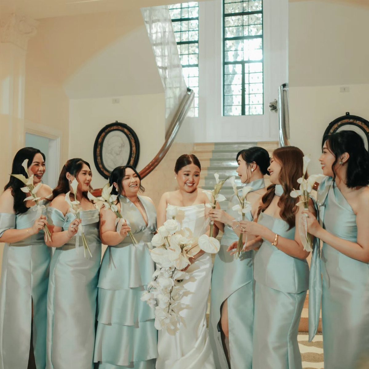
Light blue satin reads as sky reflected, not color chosen for its own sake.
The pale tone keeps it from competing with a white gown, which is the point of a bridesmaid dress; the satin finish keeps it from disappearing entirely.
White calla lilies repeat the clean lines of the dresses without adding competing color. I would keep bouquets simple; the palette is doing quiet work and busy flowers would undo it.
This suits a spring or early summer wedding with some formality in the venue: the staircase behind them, the way the satin catches light from the windows.
In a rustic barn the fabric looks misplaced; in a garden the color can wash out against sky and water. Check the setting in late afternoon light, when most photos happen, before committing.
17. Teal and Gold Table Setting
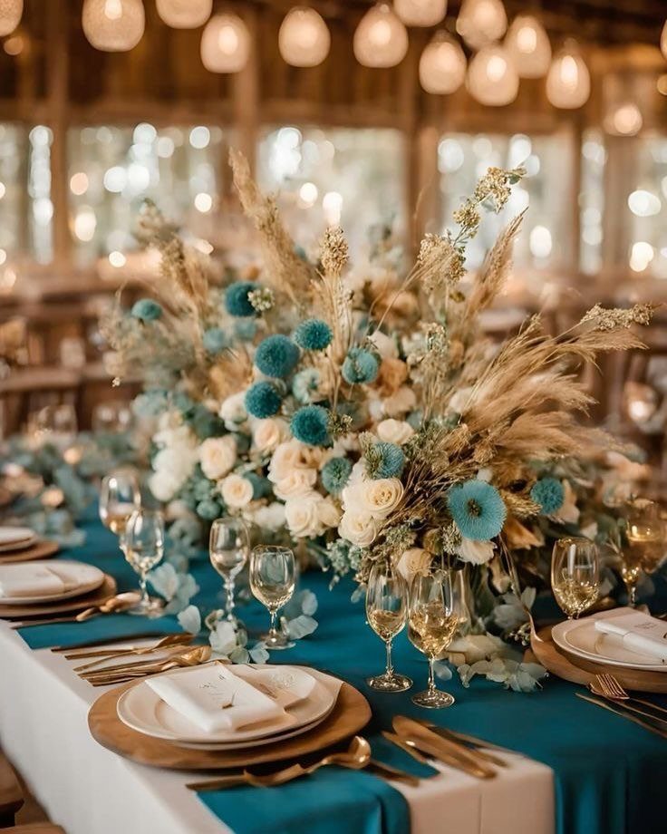
A teal runner with gold flatware sets a table that reads as decided rather than assembled. The deep teal carries enough green to stay warm; navy would go colder, turquoise would go casual.
White roses and blue flowers in the centerpiece repeat the runner without matching it exactly; the dried grasses add texture that fresh flowers alone would miss.
I would keep the plates white, not colored; the teal does enough work and tinted plates can read as dated.
Gold flatware shows fingerprints more than silver; assign someone to polish before the doors open.
This palette works across seasons but wants indoor light to make the teal read as deep rather than dark. In bright sun the color flattens; in candlelight it gains depth.
18. Deep Teal and Pink Decor
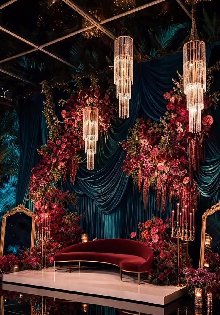
Deep teal drapery with pink floral installations is a stage, not a backdrop. The scale demands a venue that can hold it: high ceilings, a raised platform, somewhere the eye expects performance.
A third warm note, like red velvet seating, keeps teal and pink from becoming a two-color exercise.
I would not add more; the drape, the flowers, and the sofa are already in conversation. Gold candelabras repeat the metal in the chandeliers and tie the vertical elements together.
This suits an evening reception where guests arrive after dark and the lighting does the work. The cost is in fabric volume and floral density; skimp on either and the effect collapses into color blocks rather than atmosphere.
I would budget for a lighting designer who can dim the room and spotlight the stage, or the drapery absorbs too much light and disappears.
19. Lime Green Reception Decor
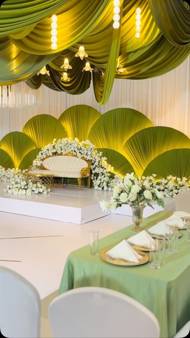
Lime green drapery overhead turns a reception into a greenhouse without the humidity. The color is bright enough to read as energy in candlelight, which matters when the ceiling does most of the work.
White flowers and pale upholstery keep the green from going tropical; gold would push it toward citrus, silver toward cool modern. I would stay with white and let the green be the single bold note.
This wants a venue with ceiling rigging already in place; installing enough hardware to hold fabric safely runs into labor costs that can match the linen rental. Check with the venue before falling for the look.
Choosing a Color Palette
Three to five colors is the workable range. Fewer and you lose nuance; more and every decision takes longer.
I would pick one neutral that exists everywhere, white or ivory or warm gray, so that when your specific shade of dusty blue is back-ordered, you still have table linens and invitation paper that coordinate without a phone call.
The neutral is not a compromise.
It is the color that lets the others exist at all. The difference is how much variation you actually want.
A tight palette of 3 forces every choice to matter. 5 gives room for an accent that shows up only in ribbon or wax seal.
Both work. The mistake is choosing a palette because it won the year.
Pantone’s pick is information, not instruction. You will live with these photos.
Venue Considerations
Your venue already chose half your palette. The carpet, the wood tone of the chairs, the stone or plaster or tent canvas, the green that shows through the windows.
These do not change. Your colors will sit against them in every photograph.
Before ordering anything, hold fabric swatches or print color cards against photographs of the actual space.
Take your own photos during the site visit, at the same time of day as your event, so you see the light your guests will see.
A terracotta tile floor in St. Augustine at 4 PM carries different weight than the same tile at 7 PM under strung lights.
If the venue’s existing drapery and linens run cool blue and your heart is set on warm peach, the fight is constant and expensive.
Better to find a warm palette that uses what is already there, or a venue blank enough to take direction. Spanish Revival architecture with its own color is not a blank; a white-walled historic interior comes closer.
Seasonal Inspiration
Season is not a mandate. It is a starting point that happens to have flowers available and light at predictable angles.
Winter gives you navy velvet and the darkness that makes candlelight necessary; spring gives you the pastels that read as fresh because they are, in fact, freshly in bloom.
The season’s own materials, the trees, the weather you already chose with your date, can carry decisions you otherwise would stall on.
Each season has color associations that show up in wedding publications tied to specific years. Those dated recommendations are historical curiosity, not current guidance.
The useful part is the underlying pattern: fall’s leaves suggest cinnamon and olive, winter’s early dark suggests jewel tones that hold up under artificial light, spring’s new growth suggests the lighter end of every palette.
Match the color to the available light and the flowers you can actually source.
A dusty blue that photographs beautifully in June can go flat in December’s gray noon. Check your date, not the trend report.
Frequently Asked Questions
What is the best color theme for a wedding?
The best color theme is one that fits your venue’s existing character and the season you’re marrying in.
Deep burgundy and gold suit a wood-paneled fall room, while dusty blue and ivory need white architecture to land against. I would start with the space you already have, not a Pinterest board, because the venue does half the work.
How do I choose wedding colors that work with my venue?
Start with what the venue already gives you: the floor, the walls, the wood grain on the chairs, the view through the windows.
You can work with those tones or push against them on purpose, but pretending they are not there is a choice you will notice in the photos later.
A historic house with existing molding carries emerald and gold; a plain tent needs the color to do more work on its own.
How many colors should a wedding color palette have?
Three to five colors is the workable range. One neutral that runs through everything, white or ivory or warm gray, saves you when the exact shade you ordered is back-ordered and the replacement is close but not identical.